How to Build a Site with WordPress Website Builder Start
Onboarding with WordPress Website Builder Start, our Site Creation tool, is changing the game in creating websites for businesses and individuals. Advanced artificial intelligence makes website creation easier for users. With WordPress Builder Suite, you can create amazing, professional-looking websites easily, regardless of your technical know-how.
WordPress Website Builder Start: Site Creation Benefits
It is our engine for creating websites. You can get started with the Site Creator by answering a few quick questions, and our Site Creator will generate 3 fully built website options for you to choose from. Site Generation takes the guesswork out of choosing your fonts, images, and starting content so that you can get started in minutes.
Key Benefits:
- Build a website in minutes.
- Fonts, colors, design, and starting content are created for you
- Easily edit any of the sections provided for faster website creation
- Auto installs the needed plugins to deliver a fully functional website
WordPress Website Builder Start: Site Creator Walk Through
Follow the steps in the How to Install WordPress Using the Bluehost Portal article to start using our Site Creator engine.
After logging in, you'll be greeted by WordPress Builder Start—a personalized onboarding experience designed to simplify website creation. It will ask you a few questions and use your answers to customize your site setup.
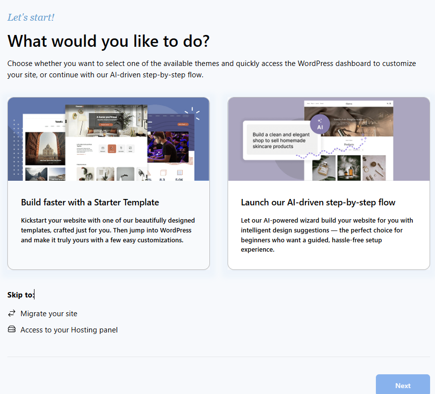
Step 1: Website Setup Options
When setting up your website on Bluehost, you're presented with two streamlined paths to get started:
-
Build Faster with a Starter Template
Choose from a selection of professionally designed templates tailored to different website needs. This option lets you quickly launch your site and customize it in WordPress to match your brand and style. -
Launch the Step-by-Step Flow
Ideal for beginners, this guided setup offers intelligent design suggestions and walks you through each step of building your site, making the process simple and hassle-free.
Additional options include:
- Site Migration for transferring an existing website.
- Access to the Hosting Panel for advanced settings and management.
Select Launch the Step-by-Step Flow and then click Next to proceed.
Step 2: Provide Site Information in Bluehost Setup
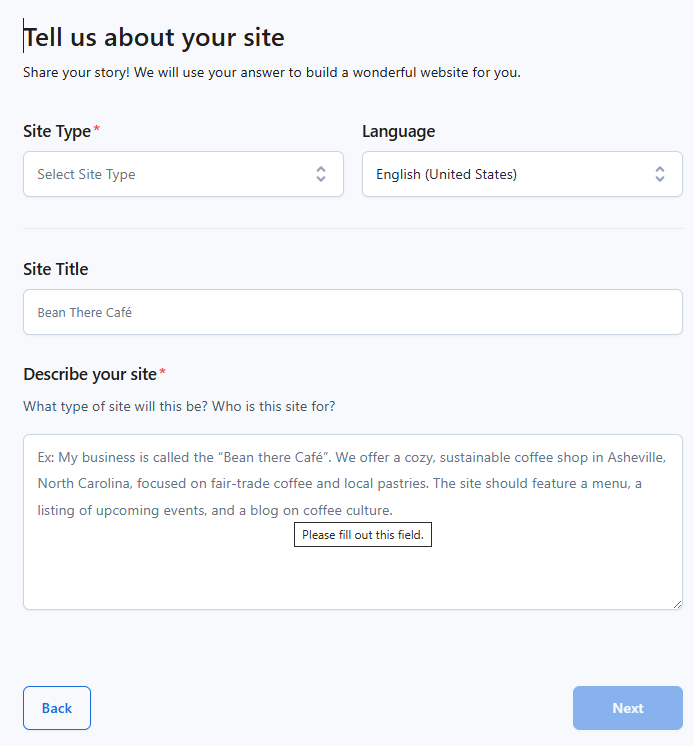
- Use the "Select Site Type" dropdown to choose the category that best describes your website (e.g., Personal, Business & Service, Online Store).
- Confirm or change the language for your site. The default is English (United States)
- Fill in the name of your website in the Site Title field.
- In the Describe your site text area, provide a brief overview of your business or purpose.
- Once all required fields are filled out, click the Next button to proceed with the website setup.
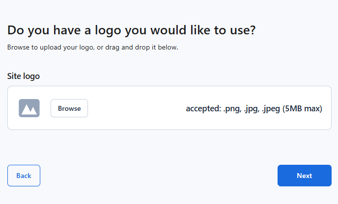
Step 3: Upload Your Site Logo
 <
<
- You’ll be asked: “Do you have a logo you’d like to use?”
- Upload Your Logo (Optional)
- Click Browse to select a logo file from your device.
- Accepted formats: .png, .jpg, .jpeg
- Maximum file size: 5MB
- Once you’ve uploaded your logo (or skipped this step), click the Next button to continue.
Step 4: Tailor Your WordPress Experience
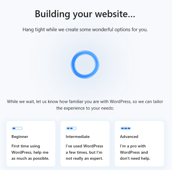
- Bluehost is generating personalized website options for you. A message appears:
“Hang tight while we create some wonderful options for you.” - To customize your onboarding experience, choose one of the following:
- Beginner
First time using WordPress, help me as much as possible. - Intermediate
I've used WordPress a few times, but I'm not really an expert. - Advanced
I'm a pro with WordPress and don't need help.
- Beginner
- After selecting your experience level, Bluehost will tailor the setup and guide you accordingly.
Step 5: Choose Your Website Design
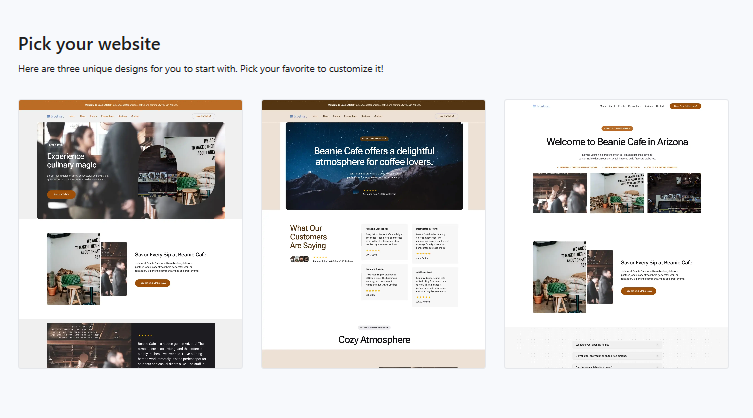
- Bluehost offers three unique website design options. These are pre-built templates tailored to your earlier inputs.
- Browse through the designs and select the one that best fits your brand or vision. Each template is fully customizable later.
- Once you've selected a design, proceed to the next step to begin customizing your site.
Step 6: Customize Your Website Layout
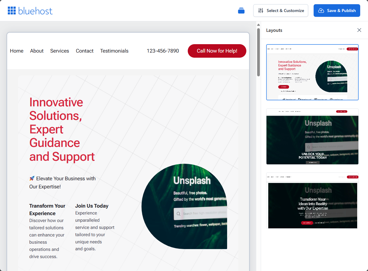
- You’ll see a sample layout featuring placeholder content such as:
- Headline
- Sections
- Navigation
- Use the layout editor to customize:
- Text sections (e.g., business tagline, service descriptions)
- Navigation menu items
- Call-to-action buttons and contact info
- Add high-quality, royalty-free images to your site.
Once you're satisfied with the layout and content, click the Save & Publish button located in the top-right corner.
To continue building or managing your site, click the Select & Customize button.
On the next page, you can further enhance and personalize your WordPress installation using WordPress Website Builder Blocks.
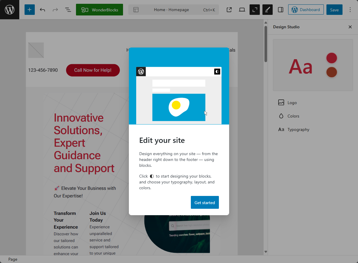
When you're finished, click the Save button in the top-right corner.
You can also access your WordPress Admin dashboard by clicking the Dashboard button.
Related Articles
Summary
WordPress Website Builder Start Site Creation is revolutionizing website development by being the first to introduce artificial intelligence. With the process now made easier and the power tools at your fingertips, WordPress Builder Suite gives you the ability to develop professional, customized websites quickly and effectively.
If you need further assistance, Bluehost Chat Support is available 24 hours a day, 7days a week while Bluehost Phone Support is available 7 days a week from 7 am-12 midnight EST.
- Chat Support - While on our website, you should see a CHAT bubble in the bottom right-hand corner of the page. Click anywhere on the bubble to begin a chat session.
- Phone Support -
- US: 888-401-4678
- International: +1 801-765-9400
You may also refer to our Knowledge Base articles to help answer common questions and guide you through various setup, configuration, and troubleshooting steps.