
Key highlights
- Understand why responsive design is essential for modern websites, as mobile traffic now accounts for over 62% of global usage.
- Learn how a responsive layout improves SEO and conversion rates by delivering better user experiences across all devices.
- Explore step-by-step instructions to build a responsive website using tools like WordPress, responsive themes and Bluehost’s website builder.
- Know which design features, like flexible grids, media queries and mobile-friendly navigation, make a site truly responsive.
- Uncover how Bluehost simplifies responsive design with built-in optimization, mobile-ready templates and fast-loading, secure hosting.
If your website frustrates mobile users, you’re losing more than half your audience very fast. Today’s visitors don’t just browse on desktops. They scroll, tap and shop from phones, tablets and every screen in between.
According to Statista’s 2025 Web Traffic report, over 62% of global web page views come from mobile devices (excluding tablets). That’s more than half of your potential audience using mobile screens.
A responsive website helps you meet your audience where they are. It automatically resizes your content for any device, so everything looks clean and works properly. Whether someone visits from a smartphone or a laptop, your site needs to feel consistent and easy to use.
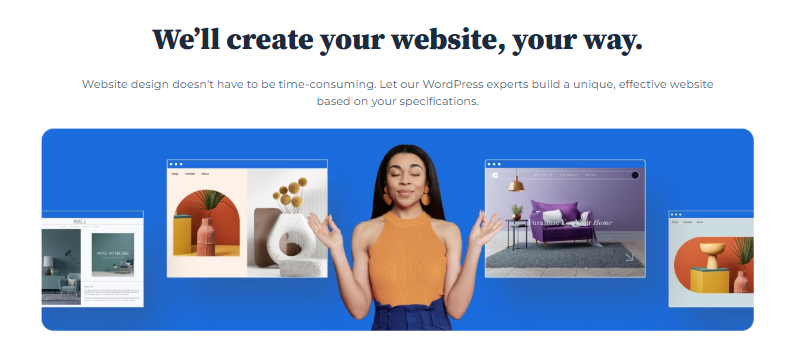
In this guide, we’ll explain what a responsive website is, why it matters and how to build one. At Bluehost, we make it simple to create a mobile-friendly website even if you’ve never built one before.
What is a responsive website?
A responsive website is a mobile-friendly website that automatically adjusts its layout, design and content to fit various screen sizes and mobile devices, including smartphones, tablets and desktop computers. It ensures a seamless user experience for all mobile users by adapting to different browser widths, viewport meta tags and media queries.
This approach relies on responsive web design techniques such as fluid grids, flexible images and optimized font sizes to maintain clarity and usability. A truly mobile-optimized site improves website speed, reduces file size and ensures clickable elements and call-to-action buttons remain accessible on small screens.
By focusing on mobile-friendly design, web developers can enhance user satisfaction, improve search engine rankings and increase overall web traffic, making the website look and perform perfectly on any device width or browser window without needing a separate mobile site.
Also read: Why You Need a Responsive Website
Why does responsive design matter in 2026?
In 2025, having a responsive website and mobile-friendly design isn’t optional; it’s essential. A mobile website that adapts to all screen sizes ensures a fast, seamless experience for mobile users and web developers alike. It improves usability, boosts performance and enhances search engine rankings across different devices.
Top reasons responsive web design matters in 2026
- Mobile traffic dominates: Most users browse from mobile phones and tablets, making mobile-friendly pages critical.
- Better SEO performance: Search engines like Google prioritize mobile-optimized websites that load fast and use responsive layouts.
- Improved user experience: A responsive web page adapts to any browser size or viewport width, providing smoother navigation.
- Higher conversions: Simplified layouts, legible fonts and fast-loading content increase engagement and reduce bounce rates.
- Future-ready design: Responsive websites support evolving mobile devices, ensuring long-term stability without compromising quality.
These benefits make responsive web design a must for every mobile website design in 2025. It helps you make a website mobile-friendly, enhance website speed and deliver consistent performance across mobile browsers and desktop versions.
1. Mobile traffic is the new normal
People are no longer just browsing on desktops. Most users now access websites from mobile phones or multiple devices throughout the day. If your site isn’t built for mobile users, it won’t just look bad; it may not work well at all.
Responsive websites adapt to each user’s device. So, they load faster, display better and offer a smoother user experience across all screen sizes.
2. Better search rankings and SEO benefits
Search engines care about mobile usability. Google prioritizes mobile-friendly websites in its search results, especially when users are on their phones. A site that responds well to browser size and viewport width is more likely to rank higher.
Using responsive web design helps improve visibility, especially in mobile searches, by showing that your site meets current SEO best practices. You can also use best SEO tools to test your site’s mobile performance, page speed and responsiveness. All these factors affect how search engines rank your site.
3. More conversions with better UX
Responsive sites don’t just look better, they perform better. A smooth, responsive layout improves how visitors interact with your page. If people can easily click buttons, read text and load images on any screen size, they’re more likely to stay and take action.
Good website speed, easy navigation and design that scales correctly can contribute to better engagement and higher conversion rates.
How can you build a responsive website step-by-step?
A responsive website means your web pages automatically adjust to different devices desktop computers, tablets and mobile phones, without breaking the layout. This ensures a mobile-friendly site that loads fast, looks good on all screen sizes and keeps users engaged. Here’s how you can create a mobile-optimized WordPress website step by step:
Step 1: Start with reliable hosting and WordPress installation
Your hosting is the foundation of your website speed and performance. If your hosting is slow, even the best responsive design won’t help.
- Choose a hosting provider optimized for WordPress.
- Options include Bluehost, HostGator, SiteGround (all popular in the US).
- Bluehost WonderSuite is beginner-friendly; it sets up WordPress automatically, gives you a free domain for the first year, SSL for security and an AI-guided onboarding (WonderStart).
Example: Instead of manually installing WordPress and connecting your domain, Bluehost auto-installs WordPress and sets up a mobile-friendly website base for you.
Tip for businesses: Always choose hosting with a US-based data center or global CDN for better loading speed in North America.
Step 2: Select a mobile-friendly theme
Your theme controls how your site appears across different devices. Not all WordPress themes are responsive, so choose wisely.
- Good free themes: Astra, Neve, GeneratePress, Kadence.
- Premium themes often include responsive layouts and mobile web design built-in.
- Bluehost WonderTheme automatically creates responsive templates with your chosen fonts and colors.
Example: A lawyer’s website built with Astra adapts perfectly to browser width changes, ensuring clickable elements are easy to tap on small screens.
Tip: Before activating any theme, test it on real mobile devices to confirm it looks and works correctly.
See responsive design in action! This video shows how modern themes make every website mobile-friendly and SEO-ready.
Step 3: Build responsive layouts with page builders
Once your theme is active, you’ll design responsive pages like Home, About, Services and Blog.
- Use the WordPress Block Editor (default, simple to use).
- Or use Elementor or Beaver Builder for drag-and-drop control.
- Both let you preview layouts for desktop, tablet and mobile screens.
- Bluehost WonderBlocks includes pre-designed responsive sections (hero banners, contact forms, services grids).
Example: A three-column “Our Services” section on desktop should collapse into a one-column mobile layout for better readability.
Tip: Use percentage widths (50%, 100%) instead of fixed pixel sizes so your site adapts smoothly across different devices.
Step 4: Optimize images and media for mobile users
Images are one of the biggest reasons a mobile website slows down. Mobile users in the US often browse on cellular data, so speed matters.
- Compress images with plugins like Smush or ShortPixel.
- Convert to WebP format (smaller file size).
- Add the viewport meta tag in WordPress (handled automatically in most themes).
- Use the max-width property in CSS to prevent images from overflowing.
Example: Instead of uploading a 4000px-wide image, resize it to 1200px for desktop and let WordPress scale down for mobile devices.
Tip: Keep file sizes under 200KB per image for faster loading on mobile networks.
Step 5: Create a mobile-friendly menu
Navigation is critical for user satisfaction. On small screens, menus should be simple, easy to find and easy to tap.
- Use a hamburger menu (☰) on mobile.
- Keep only essential functions upfront (e.g., Home, Services, Contact).
- Test clickable elements to ensure they’re not too close together.
Example: An online store should prioritize “Shop” and “Cart” links in the mobile menu instead of hiding them.
Tip: Follow Google’s advice; menus should be easy to navigate without zooming or pinching.
Step 6: Improve website speed for mobile traffic
Google considers loading speed a ranking factor. A slow site = poor mobile-friendly design and lower search engine rankings.
- Use a caching plugin (LiteSpeed Cache, WP Rocket).
- Enable a CDN (Bluehost includes Cloudflare for free).
- Avoid heavy pop-ups that block the mobile site.
Example: A blog with 5MB background videos may look great on desktops, but will frustrate mobile users on 4G networks.
Tip: Test your site speed on Google PageSpeed Insights and fix flagged issues like “large image files” or “render-blocking JavaScript.”
Step 7: Test on real mobile devices and online tools
Never assume your website works; always test it.
- Use Google’s Mobile Friendly Test (free tool).
- Preview in WordPress Customizer (desktop, tablet, mobile view).
- Use Chrome DevTools to check screen width variations.
- Test on real devices (iPhone, Android, tablets).
Example: A contact form may look fine in a browser window but appear cut off on an actual mobile screen.
Tip: Check Google Analytics to see how much of your web traffic comes from mobile vs desktop.
Step 8: Keep it updated, simplified and user-friendly
A responsive page is not just about design, it’s also about usability.
- Update WordPress, plugins and themes regularly.
- Use legible fonts and ample white space for readability on mobile screens.
- Prioritize critical functions like contact forms, CTAs and search functions.
Example: On mobile, your call to action (“Book Now” button) should be visible without scrolling.
Tip: Always check how your site performs after updates to ensure no layout breaks on different devices.
TL;DR: How to make website mobile-friendly
- Responsive layout: Use flexible grids & percentage widths so the design adapts to all screen sizes.
- Viewport meta tag: Add in <head> to control scaling on mobile devices.
- Optimize images: Compress, use responsive sizes/WebP and limit heavy visuals.
- Enhance readability: Font size ≥16px, clear fonts, strong contrast for text.
- Simplify navigation: Use hamburger menu, large/tappable buttons, single-column stacking.
- Reduce distractions: Minimize pop-ups & clutter for smoother mobile browsing.
- Test on real devices: Check on actual phones & tablets for usability across screen sizes.
What features make a website truly responsive?
A responsive website uses smart mobile design techniques that allow your site to adapt to every screen size, device width and browser window. These features help ensure your website is mobile-friendly, loads quickly and delivers a seamless experience for all mobile users, without compromising quality or needing a separate desktop version.
Key features of a responsive website mobile-friendly
- Fluid grids and flexible layouts
- Viewport meta tag for scaling
- Optimized images and file sizes
- Simplified navigation and hamburger menu
- Readable font size and legible text
- Media queries for different screen sizes
- Clickable elements and touch-friendly buttons
- Fast loading speed on mobile browsers
- Consistent design across all devices
- Prioritized content for mobile-friendly pages
These essential responsive design features help web developers and website owners create websites that look perfect on mobile devices, tablets and desktop computers alike. They also improve search engine rankings, user satisfaction and overall web traffic.
| Feature | Mobile-friendly | Responsive |
| Adapts to screen size | ❌ | ✅ |
| Multiple device views | ❌ | ✅ |
| Single URL structure | ✅ | ✅ |
| Dynamic resizing | ❌ | ✅ |
1. Flexible layouts that adjust to any screen
Responsive layouts use flexible grids instead of fixed widths. This means your content resizes based on the browser width and device screen sizes.
Using percentage-based widths and CSS properties like max-width helps your layout scale across mobile, tablet and desktop views.
2. Media queries and breakpoints
Media queries allow you to change styles based on screen width. You can set media query breakpoints that trigger different layouts depending on the user’s device.
For example, a two-column layout may stack into one column on a mobile screen to improve readability.
3. Mobile-friendly navigation
Small screens need simplified menus. A hamburger menu keeps your site clean and easy to navigate on mobile phones and other devices.
Clickable buttons and clear spacing help users tap easily without zooming or frustration.
4. Images that scale smoothly
Use image formats that adjust to the viewport width and load fast on mobile devices. Use width ‘100%’ or similar rules to make sure your images fit their containers on all screens.
This improves website speed and avoids layout issues on different device screen sizes.
What are the best tools to build a mobile-friendly site?
To create a responsive website, you don’t need to code from scratch. Modern AI-powered tools and website builders make it easy to design a mobile-friendly website that adapts beautifully across all mobile devices, screen sizes and browsers.
Top 5 Tools for a Mobile-Friendly Website
- Bluehost WonderSuite (AI builder + mobile templates)
- WordPress + responsive themes
- Elementor (drag-and-drop responsive builder)
- Gutenberg blocks (block-based WordPress editor)
- Chrome DevTools + Google Lighthouse (testing and audit tools)
These tools help web developers and website owners design mobile-optimized, responsive web pages that perform well on different devices, ensuring a seamless user experience and better search engine rankings.
1. Bluehost website builder
At Bluehost, we offer a drag-and-drop website builder made for non-tech users. All of our templates are mobile-friendly and built with responsive design in mind.
Use built-in tools to preview your site across multiple devices and launch a responsive web page in just minutes.
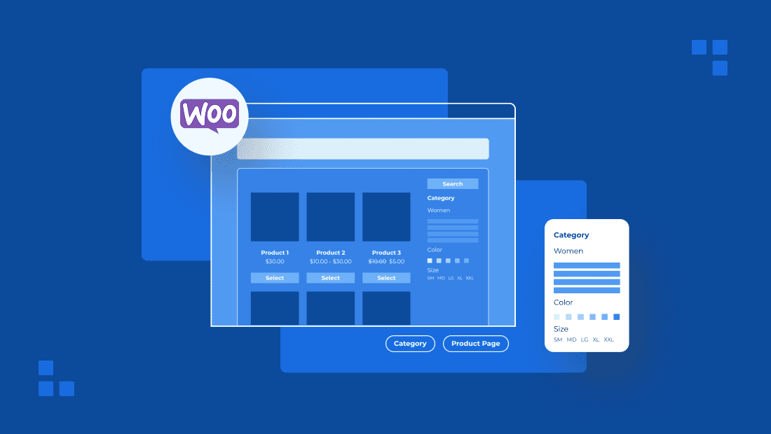
2. WordPress and mobile-optimized theme
WordPress is one of the most popular web platforms. With Bluehost WonderSuite, you get WonderTheme. This block-based, mobile-friendly theme works seamlessly across phones, tablets and desktops.
It’s flexible, fast and ideal for bloggers, small business owners and creators.
3. Elementor and Gutenberg blocks
If you want more control without coding, try Elementor or the Gutenberg block editor. Both offer responsive layout controls, live previews and settings for different screen sizes.
These tools work great with WordPress and help you create pages that scale perfectly across various screen sizes.
Also read: How to Use the WordPress Gutenberg Editor
How does Bluehost make responsive design easier for beginners?
At Bluehost, we understand that not everyone is a web developer or designer. That’s why we’ve built smart tools that make responsive website design simple, fast and effective for anyone, from beginners to business owners.
Top Bluehost features for building a mobile-friendly website
- Built-in responsive optimization tools
- WonderTheme (mobile-friendly WordPress theme)
- AI-powered website builder (WonderSuite)
- Automatic viewport meta tag and mobile scaling
- Speed, security and performance optimization
These tools ensure your website is mobile-friendly, loads fast on mobile devices and adapts smoothly to any screen size or browser window. Bluehost empowers you to create a responsive web design that enhances user experience, improves search engine rankings and keeps mobile users engaged.
1. Built-in optimization from the start
Our WordPress hosting comes with built-in AI website building tools that help your site adapt to any device. You don’t need to adjust code or worry about media queries; we handle that for you.
We also include the viewport meta tag and mobile scaling settings by default, so your pages look right on any browser window or screen size.
2. A theme that works on all screens
We offer WonderTheme, which helps you create a responsive, mobile-friendly website. Your web page will stay clean, readable and usable whether someone is browsing from a mobile phone or laptop.
3. Speed and security that support UX
Our sites load quickly on both mobile and desktop devices. We compress files, optimize image formats and help reduce loading time so visitors stick around.
Plus, every plan comes with a free SSL certificate and reliable uptime. So, your users get a secure, fast experience no matter their device or browser size.
Final thoughts
A great responsive website doesn’t just look good, it works smoothly on desktop and mobile, loads fast and feels easy to use. Whether you’re using a large monitor or a mobile screen, your site should adapt instantly and offer the same quality experience.
At Bluehost, we help you get there. Our website builder supports mobile-first design with smart defaults like min-width, meta name=”viewport” tags and flexible div class layouts. You don’t have to write any HTML; we’ve handled the technical details for you.
Ready to build a responsive website? Choose Bluehost WordPress hosting and launch your website in a few simple steps.
FAQs
To make your website mobile-friendly, use a responsive website design approach. This includes flexible layouts, optimized images and the viewport meta tag to ensure your site looks perfect on any mobile browser or device. You can also use builders like Bluehost, WonderSuite or WordPress responsive themes to create websites that automatically adapt without compromising quality.
Responsiveness connects both UI (User Interface) and UX (User Experience). A responsive web design ensures every element, from buttons to menus, adjusts seamlessly to different screen sizes. This enhances user satisfaction by keeping your mobile-friendly pages easy to read, clickable and accessible, no matter how users browse your site.
Yes! Using AI tools like ChatGPT and Bluehost’s AI builder, you can make a website mobile-friendly without coding. ChatGPT can generate content, simplified layouts and even help design mobile website pages that perform well in search engines and adapt beautifully to both mobile and desktop versions.
No, a modern responsive website doesn’t need a separate mobile URL (like “m.yoursite.com”). Instead, responsive design uses one URL that adjusts automatically based on the user’s device width. This keeps your SEO performance strong and ensures users browse a consistent experience across all screens.
The cost of creating a mobile website design depends on the tools and hosting plan you choose. With platforms like Bluehost, you can start building a mobile-friendly site affordably using AI-powered website builders and pre-designed templates. These tools make it easy to make a mobile site with simplified layouts, optimized speed and a fully responsive design, all without coding.


Write A Comment