
Key Highlights
- Implement responsive design for seamless mobile experiences
- Optimize page speed to reduce bounce rates
- Prioritize accessibility standards for inclusive user experiences
- Streamline navigation to improve user engagement
- Apply consistent visual branding across all pages
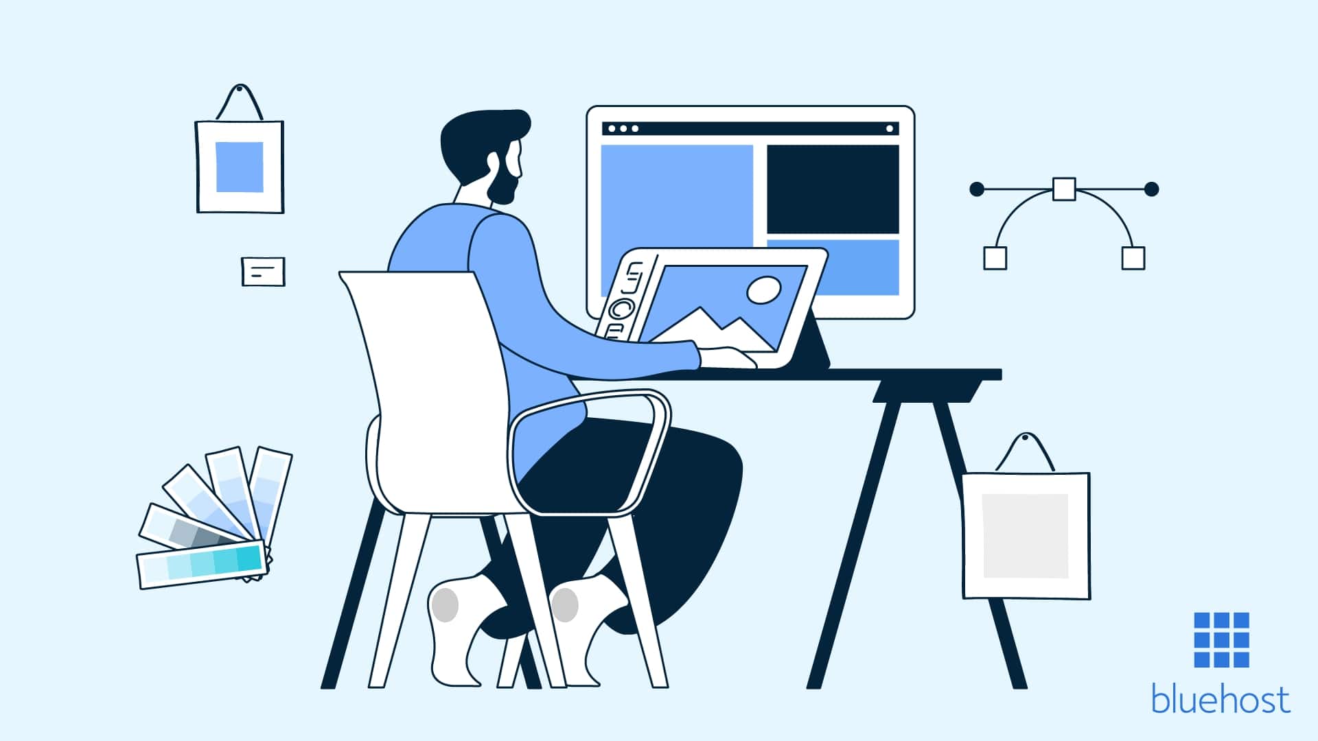
With thousands of themes, templates and plugins available for use, you can create a responsive website within a few minutes, even if you have no coding knowledge.
However, owning a website isn’t enough to make an impact, especially if you’re running an eCommerce business. You need to attract traffic and keep visitors engaged. And with countless websites competing for people’s attention, standing out can be a challenge.
If you want to elevate the look and feel of your website, you need to follow best practices for web design. In this guide, we’ll explore the benefits of a good web design. Then, we’ll reveal various web design best practices to implement in 2023.
TL;DR: Essential web design practices for 2026
- Prioritize mobile responsiveness as the foundation of your design strategy.
- Focus on site speed optimization to keep users engaged and improve conversions.
- Create clear navigation paths that guide visitors to their goals effortlessly.
- Use consistent branding elements including colors, fonts and imagery throughout your site.
- Test your design across multiple browsers and devices before launching to ensure universal compatibility.
What defines web design best practices?
Web design best practices represent a set of proven guidelines and industry standards that ensure a website is effective, functional and user-friendly. Unlike temporary design trends that often prioritize aesthetics over function, best practices are grounded in extensive user research and data-driven insights. These methods offer lasting value because they focus on how users actually interact with digital interfaces, ensuring your design choices support business goals rather than just following the latest fad.
These standards are not static; they evolve alongside advancements in technology, changes in user behavior and updates to search engine algorithms. However, the underlying principle of creating a seamless experience remains the same. By adhering to these guidelines, you eliminate guesswork and build a foundation that supports long-term growth. When determining if a design choice qualifies as a best practice, consider these core defining factors:
- Accessibility and Usability: A quality web design must be intuitive and inclusive, allowing all visitors to navigate your site and access content regardless of their device or ability.
- Performance and Speed: Best practices prioritize technical efficiency, ensuring pages load quickly to prevent bounce rates and improve search engine visibility.
Now that you understand these foundational web design principles, let’s explore the concrete advantages they deliver for your website and business goals.
Benefits of following web design best practices
With myriad competitors in the digital landscape, following website design best practices isn’t just a choice. It’s paramount to your success. Here’s why:
Brand identity
By implementing website design best practices, you can effectively communicate your brand’s personality, messaging and values to your audience. In other words, it helps you develop a strong brand identity that aligns with your goals and resonates with potential customers.
Roughly 88% of consumers patronize only brands they trust. This highlights the need to build trust with your audience. Following web design best practices ensures you create a strong identity that differentiates your brand from competitors, making it easier for customers to trust you.
Conversion rate optimization
A website that follows the principles of good web design encourages visitors to complete a specific action, such as filling out a form, requesting a demo or buying a product. This process is known as conversion rate optimization (CRO).
Visitors are more likely to become customers when your website is responsive, engaging and intuitive. Adhering to web design best practices enables you to create a superior experience for website visitors, ultimately increasing conversion rates.
Increased search visibility
When you follow website design best practices, you’ll create an accessible and responsive design that encourages visitors to take the desired action. This signals search engines (e.g., Google) that your website is valuable to your audience.
Search engine algorithms use a variety of performance metrics (e.g., bounce rate, accessibility, click-through rate and mobile responsiveness) to analyze a website’s relevance. By following best practices for web design, your website will meet these performance standards, ultimately increasing its search visibility.
Web design best practices checklist

As the internet evolves, your website must adapt to new trends if you want to stay relevant in your niche. Below is a checklist of the most important website design best practices to implement for more conversions.
1. Simplify the navigation
Easy navigation is a key element of a good website. Visitors should be able to quickly find what they’re looking for. They’ll probably go elsewhere if your website’s navigation is complicated and this increases bounce rates.
Simplify your website’s navigation by sticking to the essentials. Don’t include too many options in your menu. Otherwise, visitors may not find what they need and may get frustrated.
You can use a horizontal menu to display your website’s most important pages, such as the About, Pricing, Features and Contact pages. If you want to link to more pages, consider using a drop-down menu.
Here are additional ways to simplify your website’s navigation and ensure usability:
- Turn your calls to action (CTAs) into buttons.
- Use breadcrumbs so users can keep track of their location on your website.
- Use short, concise menu titles.
- Order menu items by importance.
By following these tips, you’ll make your website more navigable, encouraging visitors to spend more time exploring your content.

2. Design for accessibility
In the United States alone, there are more than 40 million people with a disability. So, you’ll reach a vast audience if you make your website accessible to everyone, including people with limitations such as visual impairment, cognitive disabilities or hearing loss.
For instance, visually impaired people can’t use a mouse to explore your website. To get around this, ensure your website is keyboard-accessible. And if you have images on your website, write descriptive alternative texts, commonly known as alt texts.
When a visually impaired user accesses your webpages using a screen reader, the software reads your alt texts aloud, giving the user a description of the image he can’t see.
The Web Content Accessibility Guidelines (WCAG) provide helpful information you can use to make your site more accessible to users.
Below are some essential guidelines to take note of:
- To minimize the risk of inducing seizures, avoid including any content that flashes more than three times in a second.
- Each page should have a descriptive title.
- When creating a clickable link, use descriptive text that clearly communicates its intended purpose.
Designing your website for accessibility doesn’t only increase your reach. It also improves your search engine rankings because Google prioritizes user-friendly websites that deliver a superior online experience.
3. Optimize your website for mobile devices
The total number of mobile users worldwide is predicted to rise by 219 million between 2024 and 2028. So, if your website isn’t optimized for mobile devices, you risk alienating a large number of smartphone users.
Here’s something else to consider: 76% of U.S. adults use smartphones to make online purchases. By creating mobile-friendly websites, you’ll massively improve your reach, boost conversions and improve user experience.
Google also favors mobile-optimized websites — it predominantly uses a site’s mobile version for indexing and ranking. So, optimizing your website for mobile devices positively impacts your search engine rankings as well.
Here are a few ways to optimize your website for mobile devices:
- Use a responsive layout that adjusts to any screen size.
- Add a search bar to make your website accessible and user-friendly.
- Use font sizes that can easily be read on a small screen without requiring the user to zoom in.
- Incorporate a hamburger menu to make your website more navigable.
Just like search engines, users also enjoy mobile-friendly websites. So, optimizing your website for smartphones and other mobile devices is a web design best practice that never goes out of style.
4. Maintain brand consistency
Your branding enables people to recognize your business. That’s why it’s vital to incorporate consistent branding elements (e.g., logo, typography and color palette) all over your website.
Take Coca-Cola, for example. If you land on its website and see a green and white color scheme, you’ll immediately know that something is off because Coca-Cola’s signature colors are red, black and white.

To elevate your website, develop a strong and recognizable brand that establishes trust with your audience and differentiates you from the competition. One way to do this is by determining the personality traits that best describe your brand. Once you choose a specific personality, you’re ready to develop a consistent brand across all sales and marketing channels.
5. Use visual elements
Visual elements like images, videos, infographics or animations make your website more engaging to visitors. According to Orbitmedia, the number of visuals bloggers add to their blog posts is closely linked to how well these posts perform.
In fact, a video can increase the time your visitors spend on your website. Wistia found that people spent 1.4x more time on pages with videos than those without.
Plus, people are too busy to read through massive walls of text. A well-designed infographic can help you convey your point faster and more clearly than text alone.
In the screenshot below, Tenoverten uses visuals to break up blocks of text.

High-quality visuals are great, but if they slow down your website, visitors may not be patient enough to wait. Optimize your graphics by compressing them for faster website performance. With free tools like TinyPNG and Freemake Video Converter, you can compress images and videos without sacrificing quality.
6. Make your content easy to read
Sure, incorporating visuals into your website can grab users’ attention. But if your content is difficult to read or understand, visitors will probably leave you for a competitor.
Readability may seem like a minor thing, but it has a significant impact on user experience, especially when you consider that people spend 5.59 seconds on written content before moving on.
Use an editing tool like Hemingway to test the readability of your content. It highlights common issues (e.g., passive voice, complex words and long sentences) and also provides recommendations on how to polish your writing.
Here are other ways to make your website readable:
- Break long sentences into short, easily digestible chunks.
- Use bullet points, subheadings and numbered lists to make your content scannable.
- Use bold texts to highlight important words or phrases.
- Choose a readable font color that contrasts nicely with the background color (e.g., white text on a black background).

7. Establish a visual hierarchy
A visual hierarchy organizes website elements based on the order in which a user should view them. You can also arrange these elements based on their importance.
When applied correctly, a visual hierarchy guides a user’s attention to the most important part of your webpage and pulls focus away from what isn’t as essential.
You can implement visual hierarchy in various ways. Here are a few best practices:
- Use whitespace to create negative space around important elements.
- Use large fonts and contrasting colors to highlight key elements.
- Break up long blocks of text with appealing graphics.
- Use visual cues (e.g., arrows) to draw the user’s attention to important content.
- Use prominent headlines at the top of each page.
- Arrange subheadings based on importance.
Font size, in particular, can help you establish a clear visual hierarchy because large fonts are more likely to capture attention.
In the example below, “One app to replace them all” will be read first due to the use of large fonts.

Here’s another example of visual hierarchy in action — contrasting colors are used to draw attention.

8. Optimize for search engines
Design your webpages with search engines in mind. This results in increased traffic and, ultimately, more conversions.
Search engine optimization (SEO) is a digital marketing strategy that involves building quality backlinks, using relevant keywords and optimizing metadata. If you’re running a WordPress website, there are various plugins you can use to boost your website’s ranking in search engines. Popular options include All in One SEO (AIOSEO) and Rank Math.
AIOSEO is trusted by over three million website owners worldwide. It provides a multitude of features (e.g., XML sitemaps and rich snippets schema) you can use to boost your website’s SEO rankings.
9. Make your CTAs stand out
For users to complete an intended action, such as subscribing to your newsletter or making a purchase, you must design an effective CTA button. For your CTA to be effective, it must be bold, concise and captivating.
Here are some strategies to make your CTA stand out:
- Use contrasting colors.
- Place your CTA button in a strategic location.
- Use action words like “buy,” “download” and “subscribe.”
- Create a sense of urgency using phrases like “limited time offer” and “only a few left.”
In the screenshot below, Smartlook encourages conversions with two compelling CTAs.

Here’s what we like:
- The colored CTA buttons stand out from the background.
- The CTAs use action words (i.e., “get” and “try”) to drive action.
- The main navigation menu is clear and concise, so users can quickly find what they need.
- The CTA buttons get darker when you hover over them.
Before settling on a CTA button, determine its effectiveness by testing two or more variations. This way, you can analyze the performance of each variation and choose which performs better.
10. Ensure your website loads quickly
Fast page loading speed is crucial for the success of any website. In fact, for every second a site loads faster, the conversion rate goes up by 17%. Additionally, slow-loading landing pages are likely to earn a lower Google Ads Quality score and this can hamper your marketing efforts.
A slow-loading website may be caused by:
- A slow server.
- Unoptimized visual assets.
- Lack of a content delivery network (CDN).
- Poor coding.
- Unnecessary plugins.
You can assess your website’s performance using tools like Pingdom, Google PageSpeed Insights and GTmetrix. These tools employ different scoring methods, but they all provide valuable insights and recommendations on how to improve your website’s performance.

11. Add social icons to your website
We live in an era where social media has become an integral part of daily living and businesses are taking notice. Social media advertising expenses are expected to reach $72.33 billion in the United States by the end of 2023.
This highlights the importance of social media in digital marketing. Including social icons is a vital part of the web design process. These icons will direct users to your social media pages, where they can learn more about your offerings and interact with you.
It’s worth noting that social icons are different from social sharing buttons. Social icons link to your brand’s social media pages and are typically found in the header and footer of your website.
On the other hand, social sharing buttons allow visitors to share your website content on their social media pages. These buttons are typically found underneath or beside a post.
12. Keep testing
Website development is an ongoing process — it doesn’t stop once you launch your site because there’s always room for improvement. That’s why you need to conduct A/B testing. Alternatively called split testing, A/B testing presents users with two different versions of a digital asset to help website owners determine which option converts better.
There are various elements you can test to drive conversions. For instance, changing the color and size of your CTA button can result in more clicks. You can also run A/B tests on your CTA copy, headlines, page layout and images.
It’s important to note that what works for one business may not work for another. While A/B testing can help you figure out what’s working and what’s not, it isn’t 100% accurate, as other factors may influence whether or not a user will convert.
Web design principles and fundamentals
Effective web design relies on core principles: balance, contrast, emphasis, movement, pattern, rhythm and unity. These principles are beneficial for creating layouts that are both visually appealing and functional. For instance, achieving often involves using balance to distribute visual weight evenly, preventing a page from feeling cluttered.
Contrast is equally vital; it helps critical elements like “Sign Up” buttons stand out against background colors, instantly drawing the user’s eye. When you learn how to make a website, applying the principle of simplicity through negative space allows your content to breathe, ensuring users aren’t overwhelmed by unnecessary distractions.
Visual hierarchy and consistency serve as the framework that holds these elements together. Hierarchy dictates the order in which visitors process information, using size and boldness to lead the attention naturally from a headline to a call-to-action. Meanwhile, consistency in fonts, colors and imagery reinforces your brand identity across different pages. Understanding these fundamental bridges the gap between artistic theory and practical application. By mastering these concepts, you build a solid foundation for the specific, actionable strategies outlined in the checklist below.
Main principles of web design layout
Implementing effective layout strategies is a core part because it directly influences how users process information. A well-structured layout guides the visitor’s eye through your content hierarchy, ensuring they see your most important messages first.
- Grid Systems: Use a structure of columns and rows to align elements consistently, creating a balanced and organized page.
- Rule of Thirds: Divide your layout into a 3×3 grid and place focal points at the intersections to create dynamic visual interest.
- Reading Patterns: Design for F-patterns on text-heavy pages and Z-patterns on landing pages to match natural scanning behaviors.
- Whitespace: Intentionally leave negative space between elements to reduce clutter and improve readability.
- Above the Fold: Position your value proposition and main Call to Action (CTA) where users see them immediately without scrolling.
Website usability guidelines
Following established website usability guidelines ensures your site remains intuitive, directly impacting user satisfaction and business metrics. By incorporating Jakob Nielsen’s usability heuristics, effective web design practices prioritize user control and clarity. These proven principles not only enhance the user experience but also contribute to better search engine rankings and conversion rates.
Essential guidelines include:
- Navigation Clarity: Design predictable menus so users can find information instantly.
- Consistent Terminology: Use familiar language and standard labeling to reduce cognitive load.
- User Control: Provide clear “emergency exits,” such as a visible home button or undo options.
- Error Prevention and Recovery: Implement real-time validation forms to catch mistakes early and offer solutions.
- Recognition Over Recall: Keep navigation and options visible to minimize the user’s memory burden.
Mastering these usability fundamentals sets the stage for the specific design strategies detailed in the checklist below.
Understanding web design layout types
Selecting the right layout is a critical step in implementing effective web design best practices. A single-column layout offers simplicity and works flawlessly on mobile devices, making it perfect for narrative blogs where readability is paramount. Conversely, multi-column layouts (two or three columns) allow for a parallel balance between text and imagery, often used by online magazines to maximize screen real estate without overwhelming the reader. Grid-based and card-based layouts that are exemplified by sites like Pinterest are essential for e-commerce and portfolios, as they organize heavy content into responsive, bite-sized modules that enhance quality web design.
For a more distinct look, asymmetrical layouts create dynamic visual tension to guide users toward specific elements, though they require careful balancing to avoid confusion. Full-screen or hero layouts focus entirely on a central visual or value proposition, making them the gold standard for landing pages aiming to boost conversions. Ultimately, your layout choice directly impacts user experience and content readability. When learning how to make a website, remember that the structure must serve your content goals; a cluttered structure increases bounce rates, while a strategic layout seamlessly guides visitors to your Call-to-Action.
Web design content strategy
A successful website relies on the seamless integration of visual aesthetics and a robust content strategy. Design and content must work together to create a cohesive user experience; a beautiful site with poor messaging will fail to convert, just as high-quality content effectively gets lost in a cluttered or confusing layout. By prioritizing content planning before finalizing your visual design, you ensure that the layout supports your message rather than constraining it. This approach allows you to establish a clear information architecture and content hierarchy that highlights the most critical information.
When developing your strategy, consider how your brand’s tone of voice influences design decisions, such as typography choices and whitespace usage. Writing for the web requires a specific approach different from print media. To ensure your content is accessible and engaging, focus on the following elements:
- Scannability: Use clear headings and short paragraphs to make information easy to digest quickly.
- Visual Balance: Break up text blocks with relevant images or graphics to maintain user interest.
- Conversion Focus: Ensure every sentence supports your business goals and guides visitors toward specific calls to action.
Ultimately, quality web design is not just about how a page looks, but how effectively it communicates. By adhering to these web design best practices, you create an environment where persuasive copy and strategic visuals collaborate to drive user engagement and improve conversion rates.
Web design process overview
Implementing effective web design best practices requires a structured workflow to ensure consistency and quality. A defined process helps you avoid costly mistakes and transforms abstract concepts into a functional site that meets your business goals.
- Discovery and Research: This initial phase involves defining your goals, understanding the target audience and analyzing competitors. Establishing this foundation ensures the design strategy aligns with your specific business objectives.
- Planning and Strategy: Create a sitemap, wireframes and a comprehensive content strategy to map out the site structure. This blueprint organizes information effectively and defines the user journey before visual work begins.
- Design: Designers develop mockups, prototypes and visual elements to establish the website’s look and feel. This stage focuses on aesthetics and maintaining brand identity across all pages.
- Development: This step involves coding the website and integrating it with a Content Management System (CMS). This is essentially how to make a website functional, responsive and interactive for users.
- Testing: Conduct usability, browser compatibility and performance testing to identify potential issues. Rigorous testing ensures the site works perfectly on all devices before the public sees it.
- Launch: Finally, deploy the website to a live server and monitor performance. A smooth launch sets the stage for future growth and ongoing optimization.
Following this structured approach leads to better project outcomes and a superior user experience.
Web design factors that impact conversion rates
Implementing web design best practices involves more than just aesthetics; it directly influences your bottom line. Page load speed is critical, as every second of delay can drastically reduce conversions. Mobile responsiveness is equally vital to ensure your site functions flawlessly on any device. Paired with simple navigation, these structural elements reduce friction and prevent visitors from bouncing before they even encounter your offer.
Visual hierarchy and psychological triggers also play a major role in driving action. Strategic use of white space improves clarity, while color psychology in CTA buttons can guide users toward specific goals. Compelling headlines must hook readers immediately by communicating value within moments, ensuring quality web design translates into engagement.
Finally, establish credibility through trust signals like testimonials, reviews and security badges. To further boost results, optimize form design by keeping fields minimal, as shorter forms consistently yield higher completion rates. By focusing on these measurable design decisions, you turn your website into a powerful, high-converting sales tool.
General website guidelines
Beyond visual layout, maintaining a high-quality website requires adherence to broader operational standards that support long-term success. Integrating these general web design best practices ensures your site remains secure, compliant and consistently valuable to your visitors.
- Refresh content strategy: Keep your site current with fresh, relevant information to maintain engagement and signal authority to search engines.
- Prioritize security: Install an SSL certificate and perform regular checks to protect user data, a non-negotiable aspect of quality web design.
- Maintain legal compliance: Clearly display privacy policies and cookie notices to meet regulations like GDPR and build transparency.
- Monitor site performance: Use analytics to track speed and uptime, resolving issues quickly to prevent bounce rate increases.
- Execute routine maintenance: Regularly update plugins, themes and software to patch vulnerabilities and ensure smooth functionality.
Final thoughts
By following the website design best practices provided in this guide, you can create a visually appealing website that drives conversions and elevates your brand. So, whether you’re just starting out or looking to redesign an existing website, keep these best practices in mind for optimal performance.
If you’re ready to take your website to the next level, consider web design services by Bluehost. Our team of professional web designers will build a mobile-optimized and SEO-friendly site tailored to your needs. That way, you can focus on growing your brand.
User experience (UX) is the most important web design best practice. A mobile-responsive, accessible and intuitive site keeps visitors engaged and drives conversions.
Update your website design every 2-3 years for a major refresh. Implement continuous minor updates and testing to optimize performance and conversion rates throughout.
Yes, web design best practices evolve constantly with technology and user behavior. Mobile-first indexing, for instance, has made responsive design essential rather than optional.
Web design handles visual aesthetics and usability, while web development manages technical coding and functionality. Both work together to create functional, attractive websites.
Costs vary widely from nearly free DIY website builders to thousands for professional agencies. Your investment depends on complexity, customization needs and whether you choose templates or custom design.
Yes, you can implement web design best practices independently using modern tools. Platforms like WordPress with Bluehost enable quality design implementation without technical expertise.
Measure effectiveness by tracking bounce rate, session duration and conversion rates through analytics tools. Positive trends in these metrics indicate successful web design implementation.


Write A Comment