Nel 2016, l’utilizzo del web mobile ha superato l’utilizzo del desktop e da allora ha continuato a crescere. A partire da luglio 2024, StatCounter GlobalStats riporta che i dispositivi mobili dominano con una quota di mercato del 61,79%, rispetto al 36,04% dei desktop e al 2,17% dei tablet.

Ciò indica che, a seconda della nicchia della tua attività, più della metà dei visitatori accede al tuo sito web tramite dispositivi mobili. Pertanto, in qualità di proprietario di un sito Web, è fondamentale assicurarsi che il tuo sito WordPress funzioni bene su tutti i dispositivi, in particolare sui telefoni cellulari.
Senza un sito ottimizzato per i dispositivi mobili, gli utenti mobili potrebbero non trovare, visitare o interagire con il tuo sito web. Fortunatamente, piattaforme come WordPress.com semplificano questo processo, poiché tutti i temi WordPress, anche quelli gratuiti, sono ottimizzati per i dispositivi mobili.
Questo articolo esplorerà diversi metodi su come creare un sito Web ottimizzato per i dispositivi mobili su WordPress e perché è fondamentale per la tua attività. Ma prima, distinguiamo tra design ottimizzati per i dispositivi mobili e reattivi ai dispositivi mobili.
Design ottimizzato per i dispositivi mobili vs. design reattivo per dispositivi mobili
Design ottimizzato per i dispositivi mobili
Un sito web ottimizzato per i dispositivi mobili è progettato per funzionare allo stesso modo su diversi dispositivi, garantendo che sia accessibile e utilizzabile su dispositivi mobili. Tuttavia, non si adatta alle diverse dimensioni dello schermo. Le caratteristiche principali di un sito web ottimizzato per i dispositivi mobili includono:
Navigazione semplificata: Il sito è progettato con un layout facile da navigare su schermi più piccoli.
Testo leggibile: I caratteri vengono scelti in modo che siano leggibili sugli schermi dei dispositivi mobili senza la necessità di ingrandire.
Layout statico: Il design rimane lo stesso su tutti i dispositivi, portando a volte a un’esperienza non ottimale su schermi piccoli o grandi.
Design reattivo per dispositivi mobili
Un sito web mobile-responsive fa un ulteriore passo avanti adattando il layout e i contenuti in base alle dimensioni dello schermo del dispositivo. Ciò garantisce un’esperienza visiva ottimale, indipendentemente dal fatto che l’utente si trovi su uno smartphone, un tablet o un desktop. Le caratteristiche principali di un sito web mobile-responsive includono:
Griglie fluide: Il layout si basa su un sistema di griglia flessibile che si adatta alle diverse dimensioni dello schermo.
Immagini flessibili: Le immagini si ridimensionano e si regolano all’interno della griglia flessibile per adattarsi allo schermo in modo appropriato.
Query multimediali CSS: Queste query rilevano le dimensioni dello schermo del dispositivo e applicano regole di stile specifiche per garantire il miglior layout possibile.
Perché i siti ottimizzati per i dispositivi mobili sono importanti
Sempre più persone accedono ai siti Web utilizzando dispositivi mobili anziché computer desktop tradizionali. Avere un design ottimizzato per i dispositivi mobili è fondamentale quando si creano siti Web per fornire un’esperienza utente fluida.
Oltre a migliorare l’esperienza dell’utente, i siti web ottimizzati per i dispositivi mobili sono anche vitali per la SEO. A partire dal 2015, Google ha aggiornato in modo significativo il suo algoritmo di ricerca per dare priorità ai siti Web “ottimizzati per i dispositivi mobili”. Questo cambiamento è stato guidato da un fattore critico: la reattività mobile del tuo sito web.
Pertanto, se il tuo sito web è facilmente leggibile sui dispositivi mobili, otterrà un posizionamento più elevato nei motori di ricerca rispetto a quelli che non lo sono.
Investendo in un design del sito web ottimizzato per i dispositivi mobili, non solo migliorerà il tuo posizionamento SERP (Search Engine Result Pages), ma otterrai anche una migliore visibilità e un maggiore coinvolgimento degli utenti.
Al contrario, se il tuo sito web non viene visualizzato bene su schermi più piccoli, può avere un impatto negativo sul tuo traffico.
Come testare la compatibilità con i dispositivi mobili del sito Web WordPress
Anche se il tuo sito web potrebbe avere un aspetto fantastico su un singolo telefono cellulare (come il tuo smartphone personale), testarlo su schermi di varie dimensioni è essenziale per garantire che sia veramente reattivo. Tuttavia, testare il tuo sito web su numerosi dispositivi può richiedere molto tempo, anche con una collezione di vecchi telefoni.
Per semplificare questo, sono disponibili online molti strumenti di test gratuiti e a pagamento per i dispositivi mobili che valutano se il tuo sito WordPress soddisfa i criteri di ottimizzazione mobile. Uno di questi strumenti gratuiti per i dispositivi mobili è SEOmator.

Inserisci semplicemente l’URL del tuo sito per ricevere una rapida valutazione del suo design mobile. Se il tuo sito è completamente ottimizzato per i dispositivi mobili, riceverai un allegro messaggio di successo. Tuttavia, se i risultati indicano problemi, è necessario fare un po’ di lavoro.
Come rendere il sito web mobile friendly WordPress
Usa il design reattivo
Il responsive design è il concetto di prendere un sito web e strutturarlo in modo che cambi per adattarsi alle diverse dimensioni dello schermo. Un sito Web creato utilizzando i principi del design reattivo può funzionare sia sul cartellone pubblicitario più grande che sul telefono cellulare più piccolo. La chiave per abbracciare il responsive design è renderlo parte integrante del tuo sito web.
Il design reattivo funziona trovando le dimensioni dello schermo del browser appena prima del caricamento della pagina. Il tuo browser memorizza queste informazioni in modo da poter gestire meglio le pagine.
Una volta trovate le dimensioni dello schermo, il tuo sito web reagisce alle dimensioni regolando i segmenti della pagina per adattarli meglio alle pagine di dimensioni diverse. Su un telefono cellulare, questo probabilmente includerebbe l’allineamento di tutto in un’unica colonna e la rimozione di cose che non sono importanti. Anche i menu reattivi spesso cambiano forma.
Per integrare il responsive design nel tuo sito web, inizia selezionando una piattaforma che supporti il responsive web design.
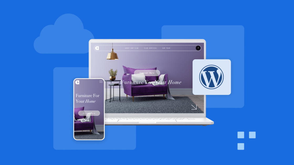
Se opti per WordPress.com, puoi scegliere tra oltre 100 temi attraenti che ti consentono di personalizzare l’aspetto del tuo sito. Questi modelli sono versatili e coprono un’ampia gamma di settori, tra cui l’istruzione, il settore immobiliare, la pubblicità e altro ancora.
Tutti i temi WordPress sono intrinsecamente reattivi, garantendo che il tuo sito funzionerà bene su dispositivi mobili, tablet e dispositivi desktop, indipendentemente dal tema selezionato. Se preferisci mantenere il tuo tema esistente, prendi in considerazione l’assunzione di uno sviluppatore per aggiornarlo.
Ottimizza tutto
Uno dei maggiori problemi per i quali le persone hanno bisogno di aiuto quando cercano di creare o accedere a un sito Web mobile è che molte risorse occupano molta larghezza di banda e altre risorse da inviare.
I dispositivi mobili hanno spesso dati limitati con cui lavorare, quindi le risorse più grandi sono un problema. Puoi trovare modi per ottimizzare molte delle risorse del tuo sito web.
Ottimizza le immagini
Le immagini possono essere file molto grandi. Tuttavia, puoi ottimizzarli per l’uso mobile utilizzando plug-in e piattaforme online gratuite.
Plugin come TinyPNG cercano di rimuovere il maggior numero possibile di dati da un file immagine senza compromettere la qualità dell’immagine. In questo modo, ogni immagine ha un ingombro minimo.
WordPress ha anche una funzione integrata che aiuta in questo. Quando rileva che il sito web è aperto su un dispositivo mobile, utilizza la versione più piccola dell’immagine disponibile.
Quindi, se non sei sicuro dell’ottimizzazione delle immagini, salva anche una versione ridotta di ogni immagine sul tuo sito web.
Ottimizzare il codice
Questo passaggio potrebbe essere un po’ avanzato per la maggior parte delle persone, ma vale comunque la pena esaminarlo. Se hai molti plugin e altri file aggiunti al tuo sito web, prendi in considerazione la possibilità di trovare modi per ottimizzare il codice del tuo sito. Molti strumenti hanno un modo per farlo internamente e automaticamente.
Tuttavia, l’aggiunta di ulteriori risorse al tuo sito Web può consentire il passaggio dei file senza essere prima ottimizzato.
Controlla i tuoi file per assicurarti che tutto sia il più compresso e pronto possibile. Questo dovrebbe richiedere meno risorse e funzionare più velocemente su un dispositivo mobile.
Utilizza plug-in ottimizzati per dispositivi mobili
I plugin migliorano la funzionalità del tuo sito WordPress e, sebbene non sempre contribuiscano con elementi visivi al front-end, alcuni lo fanno, come i widget o i pulsanti CTA. Assicurati che questi elementi si adattino bene a tutte le dimensioni dello schermo o almeno fornisci la possibilità di disabilitarli su schermi più piccoli.
Ad esempio, un widget della barra laterale è un’ottima funzionalità per un sito desktop, ma se travolge il design mobile o non riesce a ridimensionare, può avere un impatto negativo sull’esperienza dell’utente.
Simile ai temi di WordPress, presta molta attenzione alle funzionalità di un plugin. Leggi le recensioni o dai un’occhiata alle demo prima di effettuare un acquisto. Ogni volta che attivi un nuovo plug-in, esegui un rapido controllo di qualità del tuo sito per verificare che si adatti correttamente alle diverse dimensioni dello schermo.
La combinazione di un tema reattivo con plug-in ottimizzati per i dispositivi mobili consentirà al tuo sito di essere visualizzato in modo efficace su schermi più piccoli.
Limita popup
Se il tuo sito web utilizza i pop-up, trova un modo per limitarli o semplicemente rimuoverli sui dispositivi mobili. I pop-up sono difficili da gestire sui dispositivi mobili e possono allontanare i clienti.
Ma se sono importanti per la tua attività, evita di utilizzare i pop-up a schermo intero sui dispositivi mobili, poiché possono essere dirompenti. Gli utenti mobili hanno uno spazio limitato sui dispositivi mobili e cercare di navigare tra i popup che occupano più spazio può essere difficile.
Ad esempio, un pop-up a schermo intero può interferire con l’esperienza di lettura di un utente mobile coinvolto con i tuoi contenuti. Quindi, se il tuo plug-in pop-up ha un’impostazione “off” per i dispositivi mobili, usala.
Affina i dettagli
Un’altra cosa che dovresti considerare è perfezionare i dettagli del tuo sito web. Molte persone non si rendono conto che alcune scelte per il loro sito desktop non funzionano bene sui siti mobili.
Ad esempio, la dimensione e il tipo di carattere che utilizzi sul sito web sono importanti. Se usi caratteri e intestazioni enormi, non funzioneranno bene su uno schermo più piccolo. Cerca modi per regolare i tuoi caratteri e altri piccoli dettagli in modo che possano funzionare ovunque.
Inoltre, assicurati che i titoli descrittivi, i metadati e i dati strutturati siano uniformi tra le versioni desktop e mobile del tuo sito. Google consiglia di utilizzare testo, nomi di file, didascalie coerenti e testo alternativo accattivante per le versioni mobile e desktop.
Se il tuo sito per dispositivi mobili ha meno contenuti rispetto alla versione desktop, potresti notare una diminuzione del traffico.
Quindi, non rimuovere alcun contenuto, anche se il tuo sito desktop contiene contenuti estesi che sono difficili da inserire sullo schermo di un dispositivo mobile. Utilizza invece funzioni come pannelli a soffietto, menu a discesa o schede per rendere i contenuti più accessibili sui dispositivi mobili.
Testa accuratamente il tuo sito per assicurarti che queste funzionalità funzionino come previsto. L’utilizzo di un tester per siti Web ottimizzato per i dispositivi mobili può aiutarti a confermare che il tuo sito rimane reattivo su tutti i dispositivi.
Usa le versioni per dispositivi mobili
Se non è possibile incorporare un tema di design reattivo o aggiornare il vecchio tema, c’è un’altra opzione. I plug-in possono creare versioni mobili del tuo sito web.
Ad esempio, Jetpack, uno dei noti plugin di WordPress, può convertire il tuo sito Web in un modello ottimizzato per i dispositivi mobili.
Il tuo sito web continuerà a funzionare allo stesso modo su dispositivi più grandi. Quando un utente visita il tuo sito web su un dispositivo mobile, viene visualizzata la versione mobile anziché la versione desktop completa.
Questo approccio funziona in modo simile al responsive design, ma prevede dimensioni predefinite, passando dalla versione mobile a quella desktop e viceversa.
Accelerated Mobile Pages (AMP) è un’altra opzione sviluppata da Google per velocizzare il caricamento delle pagine sui dispositivi mobili riducendo la quantità di dati richiesti. I siti web con l’etichetta AMP possono essere visualizzati nelle ricerche di Google per dispositivi mobili.
Uno dei principali vantaggi di SAMPLE per WordPress è il suo codice semplificato, che rende le pagine AMP eccezionalmente veloci e reattive. La configurazione di AMP per WordPress è semplice con il plug-in AMP ufficiale, supportato da collaboratori come Google, Automattic e XWP.
Basta installare e attivare il plug-in e Google fornirà contenuti AMP agli utenti mobili. Per un maggiore controllo sui tuoi contenuti AMP, potresti prendere in considerazione il plug-in AMP per WP.
Offre opzioni di stile aggiuntive, integrazione degli annunci e pulsanti di condivisione sui social, migliorando la funzionalità oltre il plug-in AMP ufficiale.
Quando utilizzi AMP, tieni presente queste due considerazioni SEO:
- Il plug-in AMP applica i tag rel=”canonical” ai tuoi contenuti AMP, prevenendo eventuali problemi di contenuti duplicati.
- Yoast SEO si integra bene con il plugin ufficiale AMP, semplificando la gestione SEO.
Usa saggiamente i controlli touch
Assicurati che il tuo sito web sia facile da usare sui dispositivi mobili. Usa i controlli touch che funzionano bene e sono facili da trovare e utilizzare. Assicurati che i pulsanti e gli altri controlli siano della giusta dimensione e ben distanziati per i dispositivi mobili.
Ad esempio, se disponi di menu di navigazione, assicurati che siano facili da trovare e utilizzare su un dispositivo mobile.
Sui dispositivi mobili, i menu sono spesso nascosti dietro l’icona dell’hamburger e le opzioni del menu diventano pulsanti. Considera queste opzioni come pulsanti anziché come testo, per renderle più facili da usare sui dispositivi mobili senza bisogno di ulteriori modifiche per l’uso desktop.
Evitare l’uso di Flash
L’incorporazione di Flash sul tuo sito web può rallentare le prestazioni del tuo sito, influenzando negativamente sia la SEO che l’esperienza dell’utente. Può anche aumentare i tempi di caricamento della pagina ed è incompatibile con i dispositivi mobili. Optare invece per HTML5 e CSS renderà il tuo sito web più reattivo e ottimizzato per i dispositivi mobili.
Concentrati sulle prestazioni del sito
La velocità della pagina è stata a lungo un fattore critico negli algoritmi di ranking di Google per le ricerche desktop e, a partire da luglio 2018, ora influisce anche sulle classifiche mobili. Dato che oltre il 61,95% delle ricerche su Internet viene effettuato su dispositivi mobili, ottimizzare le prestazioni del tuo sito su tutti i dispositivi è più cruciale che mai.
Le immagini influiscono in modo significativo sulle prestazioni, ma anche il codice e l’host WordPress sono importanti.
Per il tuo codice, prendi in considerazione tecniche come la minimizzazione, soprattutto se stai utilizzando un tema personalizzato. Esamina tutti i plugin installati, disattivando e disinstallando quelli che non sono più necessari. Mantenere organizzati gli elementi del tuo sito migliorerà le sue prestazioni.
Per quanto riguarda l’hosting WordPress, scegli un provider di web hosting di alta qualità che offra tecnologia di memorizzazione nella cache e servizi CDN . Se stai ospitando con Bluehost, beneficerai di queste funzionalità che migliorano le prestazioni.
Testare attentamente le personalizzazioni
I costruttori di siti Web sono spesso dotati di temi e funzionalità reattivi integrati. Tuttavia, questi temi pre-progettati potrebbero non soddisfare sempre le esigenze specifiche degli imprenditori, in particolare se sono necessarie personalizzazioni avanzate. L’aggiunta di elementi personalizzati al tuo sito a volte può portare a problemi imprevisti.
Ad esempio, se si incorporano elementi CSS per evidenziare il testo chiave, il rendering potrebbe non essere eseguito come previsto sui dispositivi mobili, compromettendo l’esperienza dell’utente su schermi di diverse dimensioni.
Quando utilizzi il WordPress.com Customizer predefinito, tutte le modifiche apportate verranno applicate automaticamente a tutti i dispositivi mobili, garantendo che il design del tuo sito rimanga coerente.
Con un piano WordPress.com che supporta i plugin, puoi integrare elementi personalizzati, CSS e plugin di terze parti. È fondamentale testare rigorosamente queste opzioni di personalizzazione per assicurarsi che siano completamente compatibili con i dispositivi mobili.
Allo stesso modo, prima di installare qualsiasi nuovo tema o plug-in, verifica che siano progettati per essere reattivi. In questo modo si eviteranno problemi in cui il sito sembra non rispondere nonostante l’utilizzo di un tema reattivo.
Inoltre, l’utilizzo di media query CSS e punti di interruzione consente di applicare stili diversi in base a fattori come la larghezza del browser o il tipo di dispositivo. Ciò significa che il tuo sito si adatterà automaticamente per adattarsi a varie dimensioni dello schermo.
Considerazioni finali: sito WordPress ottimizzato per i dispositivi mobili
Rendere il tuo sito web ottimizzato per i dispositivi mobili può essere facile e veloce. In effetti, molte piattaforme di hosting, come le opzioni di hosting WordPress di Bluehost, dispongono di un sistema che ti aiuta a rendere il tuo sito web ottimizzato per i dispositivi mobili. Verifica con il tuo provider di hosting se esiste un modo semplice per far funzionare il tuo sito web su qualsiasi dispositivo già integrato.
Domande frequenti sui siti WordPress ottimizzati per i dispositivi mobili
Ecco cosa puoi fare per creare un sito WordPress ottimizzato per i dispositivi mobili:
1. Seleziona un tema WordPress reattivo per dispositivi mobili
2. Evita immagini con testo pesante
3. Regola le dimensioni dei caratteri in modo reattivo
4. Utilizzare un menu Sovrapposizione
5. Ottimizza il sito web per la velocità
Tutti i temi disponibili su WordPress.com sono progettati per essere reattivi. Ciò garantisce che, qualunque tema mobile tu scelga, il tuo sito web verrà visualizzato correttamente su telefoni cellulari, tablet e computer desktop.
Controlla se il tuo supporto si ridimensiona correttamente. Se i tuoi contenuti multimediali non si adattano, il tuo sito mobile può apparire imbarazzante. Questo problema si verifica spesso quando le immagini e altri elementi non si adattano bene a schermi di diverse dimensioni.
Diversi fattori potrebbero causare questo problema, tra cui versioni obsolete di WordPress, plugin o temi che portano a problemi di compatibilità. Inoltre, i problemi di memorizzazione nella cache a volte impediscono la visualizzazione degli aggiornamenti più recenti sui dispositivi mobili.
I tempi di caricamento lenti possono derivare da file immagine di grandi dimensioni, temi o plug-in complessi e servizi di hosting scadenti. L’uso di troppi plugin può anche contribuire a ridurre la velocità del sito.
Potrebbe essere necessario aggiornare i post memorizzati nella cache sul server sui dispositivi mobili. La regolazione delle impostazioni di memorizzazione nella cache del server di solito risolve questo problema.
Sì, i page builder possono avere un impatto sul front-end e sul back-end di un sito web. Spesso caricano più file, inclusi script, file di font e fogli di stile, il che può rallentare i tempi di caricamento della pagina. Molte di queste risorse aggiuntive vengono utilizzate in modo intermittente.
Per velocizzare il caricamento del tuo sito web sui dispositivi mobili:
1. Identificare e risolvere il problema delle risorse di blocco del rendering (RTR) eccessive.
2. Combina i file ove possibile.
3. Ottimizza l’ordine di rendering.
4. Sviluppa un approccio strategico al caricamento delle pagine.
5. Usa un tema reattivo per dispositivi mobili
6. Comprimi tutti i file possibili.
7. Memorizza nella cache le pagine appropriate nei momenti ottimali.
8. Prendi in considerazione l’implementazione di Accelerated Mobile Page (AMP).
9. Crea una strategia di caricamento della pagina.
10. Comprimi tutto ciò che puoi.
11. Memorizza nella cache le pagine giuste al momento giusto.
12. Crea pagine mobili accelerate (AMP).


Scrivi un commento