 ChatGPT,
 Claude,
 Gemini,
 Grok — all four for
Key highlights
- Bluehost offers reliable WordPress hosting, mobile-ready themes and built-in optimization tools to help you create a fast, responsive and high-converting mobile experience.
- Mobile conversion is about turning mobile visitors into paying customers, subscribers or leads.
- The most common reasons for low mobile conversion rates are poor mobile design, slow load times and complicated navigation or checkout processes.
- Optimizing your mobile checkout process is one of the fastest ways to boost conversions
- Incorporating mobile conversion optimization techniques like sticky CTAs, mobile opt-ins and minimal pop-ups improves the user experience.
- Investing in mobile SEO ensures your site attracts the right mobile traffic and performs well on search engines.
Introduction
Let’s face it — mobile visitors can be a tough crowd. They’re scrolling with one thumb, juggling distractions and expecting your website to deliver a smooth, lightning-fast experience. And if it doesn’t? They’ll be gone faster than you can say “checkout.”
Mobile traffic is no longer an ‘extra’—it is the primary source of visitors. However, the challenge isn’t just getting mobile users to visit — it’s driving mobile conversion. It is about turning those casual scrollers into actual customers.
But here’s the good news: with a few targeted adjustments, you can transform your mobile site into a conversion machine. In this guide, we’ll walk you through proven ways to boost your mobile conversion rates and turn viewers into loyal, paying customers. Let’s get started.
What is mobile conversion and why does it matter?
Mobile conversion is when a mobile visitor takes a desired action on your website or app — like making a purchase, signing up or filling out a form. In other words, it’s how mobile traffic turns into real business results.
While mobile traffic is growing, mobile conversion rates still lag behind desktop. The main reason? Many sites offer poor mobile experience — slow loading, hard-to-navigate layouts or complicated checkouts.
Optimizing for mobile conversions is essential. It leads to higher revenue, better engagement and stronger customer relationships. With tools like mobile analytics, you can identify friction points and improve the user journey to turn more mobile visits into results.
What are the top mobile conversion optimization strategies?
Improving your mobile conversion rate is all about fine-tuning the small but critical elements of your website. Since mobile users are quick to decide, you need to deliver a fast, seamless and frustration-free experience. Below are some of the most effective mobile conversion optimization strategies you can apply to get better results:
- Implement responsive web design
- Use mobile opt-ins
- Track your analytics
- Manage mobile SEO
- Improve mobile site speed
- Simplify mobile checkout
- Use sticky CTAs and clear buttons
- Reduce mobile pop-ups and clutter
With all this in mind, let’s dig deeper to know better!
1. Implement responsive web design
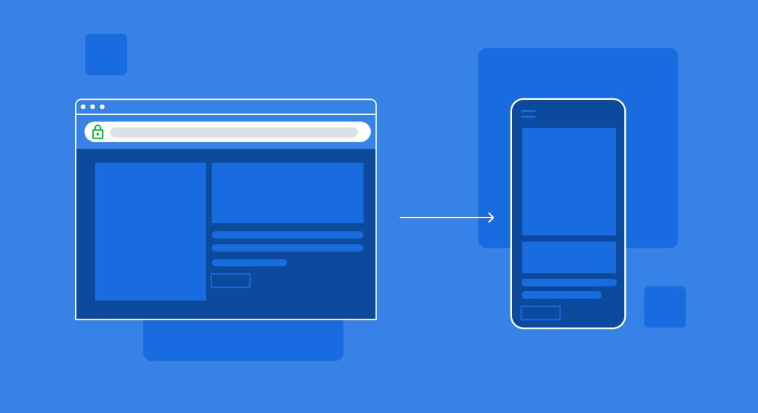
Your mobile site needs to look and function beautifully on all mobile devices — from the tiniest phone screen to the largest tablet. Responsive design automatically adjusts your site’s layout, images and content based on screen size, providing a seamless experience for mobile users. A responsive mobile website eliminates frustrating pinching and zooming and ensures that important elements like CTAs and menus are easy to tap.
Beyond user-friendliness, responsive design directly influences your mobile conversion rate. If your site feels awkward or hard to navigate, users will abandon it fast. Investing in responsive design is one of the quickest ways to improve conversion rates and keep visitors engaged longer.
Related read: How to Make Mobile Friendly Website on WordPress
2. Use mobile opt-ins
Mobile opt-ins are a powerful yet underused tool for capturing leads or nudging users towards conversions. From email sign-ups to exclusive discounts, mobile-specific opt-ins can encourage users to take action. Just make sure they’re tailored for mobile devices — no one wants to deal with oversized pop-ups on a small screen.
The key is balance. Subtle, well-timed opt-ins improve engagement without disrupting the user experience. Done right, they can contribute directly to improving your mobile conversion rate by capturing leads when users are most engaged.
3. Track your analytics
Without data, you’re guessing. Tools like Google Analytics and other analytics tools help you monitor user behavior, identify points where mobile users drop off and identify pages with the highest or lowest conversion rates. This is the foundation of smart mobile conversion optimization.
By regularly reviewing your mobile analytics, you’ll uncover which pages perform well and where you’re losing potential conversions. Whether you run a mobile app or a mobile website, data-driven decisions are essential for boosting your conversion rate and improving user satisfaction.
4. Manage mobile SEO
An often-overlooked part of mobile conversion optimization is getting people to your mobile site in the first place. That’s where mobile SEO comes in. Optimizing for mobile traffic includes making sure your site loads fast, has clear headings, concise meta descriptions and is structured for search engines and users alike.
Search engines, especially Google, heavily favor mobile-friendly websites. A strong mobile SEO strategy will not only boost your rankings but also bring in more qualified mobile users ready to convert. More targeted traffic naturally leads to a higher mobile conversion rate.
Related read: Mobile SEO Optimization Tips to Improve Ranking
5. Improve mobile site speed
If your mobile site takes too long to load, users won’t wait around. Speed is one of the biggest drivers of your mobile conversion rate. Studies consistently show that even a one-second delay can significantly lower conversion rates, especially for mobile eCommerce sites where quick decisions are common.
Compress images, use fast-loading themes and consider AMP (Accelerated Mobile Pages) for faster content delivery. Improving speed isn’t just about SEO; it’s about meeting your mobile audience’s expectations for instant access.
6. Simplify mobile checkout
A complicated mobile checkout process is one of the top reasons for abandoned carts. To simplify mobile checkout, reduce the number of steps, minimize form fields and allow for guest checkout. The fewer obstacles, the better your chances of improving the mobile conversion rate.
Consider using autofill, one-click payments or even wallet integrations on your mobile site or mobile app. A simple, secure and fast checkout can have a dramatic impact on both conversion rate and user satisfaction.
7. Use sticky CTAs and clear buttons
CTAs (Call-to-Actions) should always be visible, no matter where the user is on the page. Sticky CTAs — buttons that stay fixed on the screen as users scroll — are highly effective for improving mobile conversion. Just make sure they’re not too large or intrusive.
Clear, thumb-friendly buttons with strong action words guide users towards completing a conversion. Whether it’s “Buy Now,” “Sign Up,” or “Get Started,” visible CTAs are a small change that can lead to a big boost in your conversion rate.
8. Reduce mobile pop-ups and clutter
While mobile opt-ins can help, too many pop-ups will hurt your mobile conversion rate. Excessive pop-ups, banners and distractions frustrate mobile users, causing them to leave before completing an action.
Focus on a clean, minimal user interface with only essential elements. Give users space to navigate and convert without constant interruptions. A clutter-free mobile site not only looks better but performs better when it comes to conversion rates.
Related read: Mobile Optimization – Best Practices
What are the common reasons for low mobile conversion rate?
If you notice that your conversion rate on mobile is lower than expected, you’re not alone. Many businesses struggle to convert their mobile audience due to a few common issues that are easy to overlook but have a big impact. A few of them are as follows:
1. Poor mobile design
Poor mobile design is one of the top reasons for a low conversion rate. A mobile site that looks cluttered, has tiny buttons or isn’t responsive can frustrate users. Mobile visitors expect a smooth, effortless experience — anything less can cause them to abandon the site before converting.
2. Slow load times
Slow load times are another conversion killer. Mobile users are often on the go and a delay of even a few seconds can drastically reduce your conversion rate. A sluggish mobile site not only hurts user experience but also impacts search rankings, making it harder to attract and convert visitors.
3. Complicated navigation or checkout
Complicated navigation or checkout processes also contribute to low mobile conversion rates. If users have to zoom, scroll endlessly or fill out long forms, they’re likely to exit before completing a purchase or action. Whether you’re running a mobile app or a mobile site, simplicity and speed are key to improving the conversion rate.
Thankfully, tools like Google Analytics can help you pinpoint exactly where users are dropping off. Analyzing this data is crucial for identifying friction points and improving both your mobile app conversion rate and mobile site performance.
To stay clear of the errors and improve your mobile conversion rate, it’s important to have the right tools and hosting support in place. That’s where Bluehost can make a big difference.
How does Bluehost support mobile optimization?
Boosting your mobile eCommerce conversion rate isn’t just about design — it starts with the right foundation. Bluehost provides a range of tools and features to help you create fast, user-friendly and fully optimized experiences for mobile visitors. Whether you’re running a simple site or a full-fledged online store, Bluehost gives you everything you need to deliver seamless performance across mobile screens.
1. Mobile-optimized hosting features
Bluehost’s WordPress hosting is fully optimized for speed, reliability and scalability — three essentials for driving better mobile conversion. With built-in caching, free CDN and image optimization, your mobile pages will load quickly, even for mobile users on slower networks. This is key to reducing bounce rates and boosting your conversion rate, especially on mobile where attention spans are short.
Start optimizing your mobile conversions today with Bluehost WordPress hosting – built for speed, scalability and mobile performance- no matter the device!
2. WordPress & WooCommerce mobile themes
Through Bluehost, you get access to a wide range of WordPress and WooCommerce themes that are fully responsive and built to perform on mobile screens. These mobile-ready themes automatically adjust to fit different devices — phones, tablets or desktops — ensuring that mobile shoppers and mobile visitors have a smooth, consistent experience.
Pairing a mobile-optimized theme with Bluehost’s WordPress hosting gives you a strong combination for improving mobile conversion rate. Whether you’re managing a mobile eCommerce site, offering in-app purchases or building a simple portfolio, your site will load fast, look great and encourage users to take action.
3. Bluehost website builder’s mobile capabilities
If you prefer a simpler, no-code option, Bluehost’s website builder is designed to help you achieve great results without technical complexity. Every element you design is automatically adjusted for mobile screens and the builder takes care of essential mobile conversion optimization tasks like sticky CTAs, responsive layouts and mobile-friendly menus.
Combined with Bluehost’s WordPress hosting, the website builder gives you the flexibility to build custom pages while keeping performance high and mobile conversion top of mind. Plus, you can use analytics tools to track results and fine-tune your site based on real user behavior.
Related read: Bluehost’s Guide to Making a Mobile-Friendly Website: Benefits & Tips
Final thoughts
In today’s mobile-first world, delivering a seamless experience to mobile users is no longer optional — it’s essential. From first impressions to the final checkout, every interaction on your mobile site plays a role in improving your mobile conversion rate. Slow load times, poor design or clunky navigation can easily cause you to lose valuable mobile traffic.
With Bluehost, you have everything you need to overcome these challenges. From high-performance WordPress hosting and mobile conversion optimization tools to responsive themes and a user-friendly website builder, Bluehost equips you to create a website that not only looks great but also converts effectively on all mobile devices.
The right combination of speed, design and functionality will help you turn casual mobile visitors into loyal customers — and Bluehost is here to help you make this happen.
FAQs
A good mobile conversion rate can vary depending on your industry, but on average, rates between 1.5% and 3% are considered typical. However, with proper mobile conversion optimization, many businesses see even higher results, especially in mobile eCommerce.
There are several reasons why mobile conversion rates tend to be lower than desktop, including slow load times, poor mobile site design, complicated navigation or a difficult mobile checkout process. Optimizing these areas is key to closing the gap.
Absolutely. If you have a mobile app, applying mobile app conversion strategies like improving load speed, refining the user interface, adding clear CTAs and using push notifications can help increase your app conversion and engage more app users effectively.
Absolutely. Whether you run a blog, a service-based business, a mobile eCommerce site or a full-fledged mobile app, optimizing for mobile conversion is vital. More users now access websites via mobile phones than desktops, making it essential to focus on the mobile experience.
No, AMP (Accelerated Mobile Pages) is not necessary. Modern websites can achieve fast mobile performance using responsive design, Core Web Vitals optimization and mobile-friendly best practices without the limitations of AMP.

Write A Comment