Key highlights
- Style HTML fonts with CSS to keep text readable, consistent and easier to manage across your website.
- Choose the right font category to match each use case, from readable body copy to headings, code snippets and short design accents.
- Use web-safe font stacks to make HTML fonts display reliably across browsers, devices and operating systems.
- Add Google Fonts or custom fonts correctly to improve visual design without slowing down page performance.
- Apply font best practices for accessibility and SEO to create clearer content, better user experience and stronger search visibility.
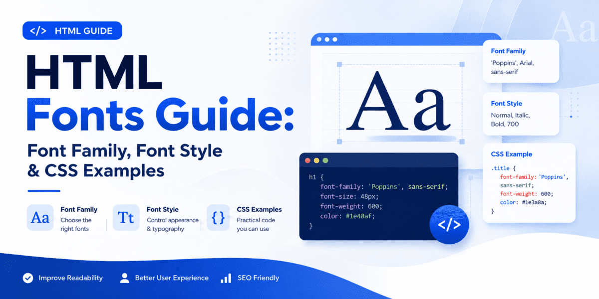
HTML font style controls how text looks on a web page, from the font family and size to weight, spacing and color. In modern HTML, these styles are handled with CSS, not the outdated <font> tag.
Choosing the right HTML fonts helps improve readability, user experience and visual consistency across your website. It also ensures your headings, paragraphs, links and buttons are easy to scan on desktop and mobile.
In this guide, you’ll learn what HTML fonts are, how to change font style in HTML, how CSS font-family works, which web-safe fonts to use and how to add Google Fonts or custom fonts without hurting readability or page speed.
What are HTML fonts?
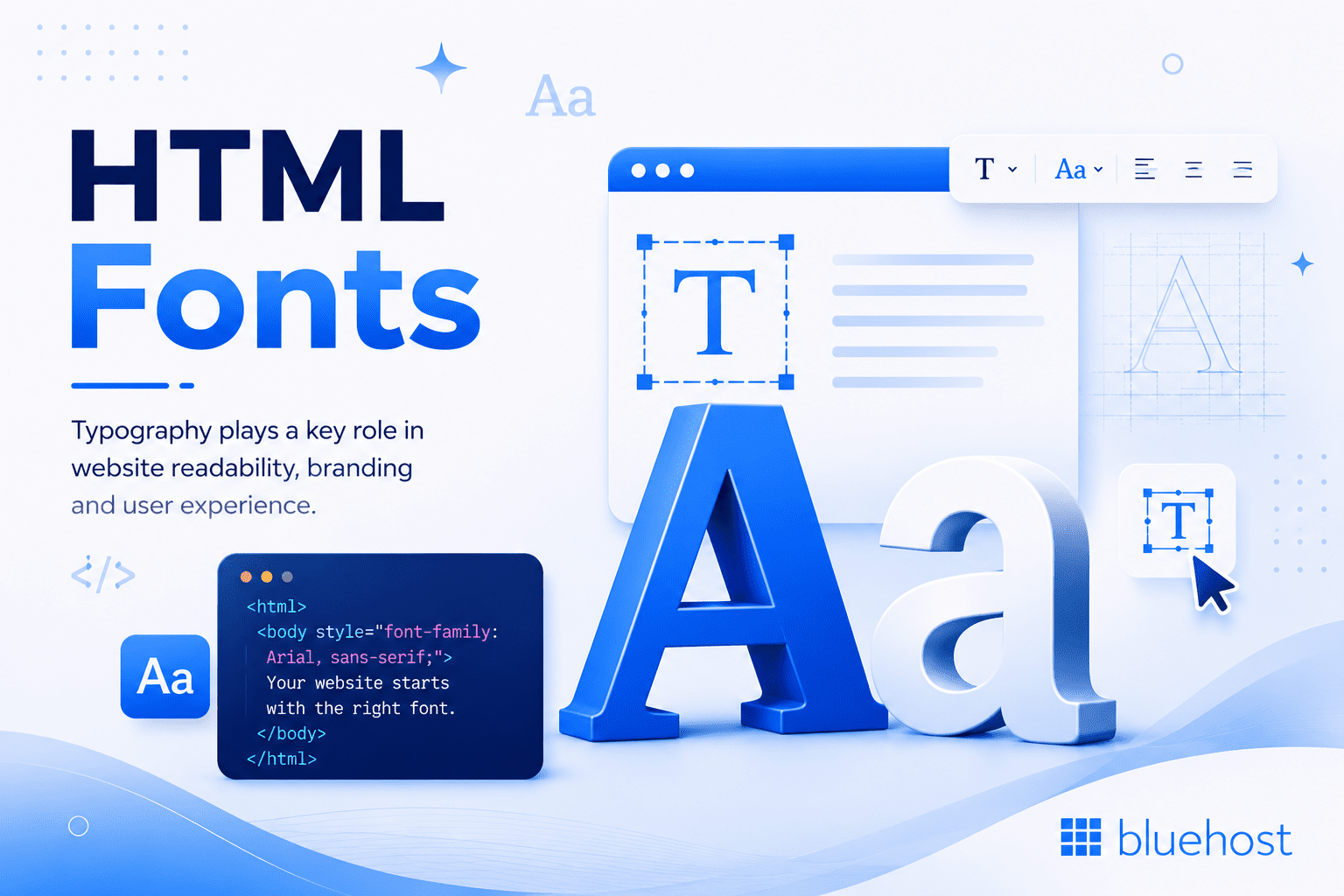
HTML fonts are the typefaces that control how text appears on a web page. They affect the look of headings, paragraphs, links, buttons and other written content.
Today, HTML fonts are managed with CSS. Instead of adding font details directly into HTML, you use CSS to define the font for the full page or for specific elements.
Example:
body {
  font-family: Arial, Helvetica, sans-serif;
}
A font setup usually includes a main font and fallback fonts. This helps the browser display readable text even if the first font is not available.
For website content, the best HTML fonts are easy to read, consistent with your brand and reliable across devices. Web-safe fonts are useful because they are widely supported, while Google Fonts or custom fonts can be used when you need a more specific design style.
How to change font in HTML?
The recommended way to change font style in HTML is with CSS. HTML controls the structure of the content, while CSS controls how that content looks.
For example, you can add a class to your HTML:
<p class="intro-text">Welcome to my website.</p>Then style it with CSS:
.intro-text {
  font-family: Arial, Helvetica, sans-serif;
  font-size: 18px;
  font-style: normal;
  font-weight: 400;
}
This method is easier to manage than adding styles directly to every HTML element.
You may still see older examples that use the <font> tag:
<font face="Arial" size="4">This is old HTML font code.</font>Avoid this method. The <font> tag is obsolete in modern HTML. Use CSS instead.
Also read: What is CSS? Beginner’s Guide with Examples & Practical Tips
Understanding HTML font style categories
Most HTML fonts fall into a few common categories. These categories help you choose the right font style for headings, body text, buttons and code snippets.
| Font category | Best for | Examples |
|---|---|---|
| Serif | Formal sites, editorial content | Georgia, Times New Roman |
| Sans-serif | Most websites and apps | Arial, Helvetica, Verdana |
| Monospace | Code and technical content | Courier New, Consolas |
| Cursive | Short decorative text | Brush Script MT |
| Fantasy | Rare decorative use | Impact, Papyrus |
For most websites, sans-serif fonts are the safest choice for body text because they are clean and easy to read on screens. Serif fonts can work well for headings or long-form blog content.
Avoid using cursive or fantasy fonts for full paragraphs. They can be difficult to read, especially on mobile devices.
Best web-safe fonts for HTML
Web-safe fonts are fonts that are commonly available across most devices and operating systems. Using web-safe HTML fonts helps your text display consistently without loading extra font files.
| Font | Type | CSS font stack | Best use |
|---|---|---|---|
| Arial | Sans-serif | Arial, Helvetica, sans-serif | Body text |
| Helvetica | Sans-serif | Helvetica, Arial, sans-serif | Clean layouts |
| Verdana | Sans-serif | Verdana, Geneva, sans-serif | Small text |
| Georgia | Serif | Georgia, "Times New Roman", serif | Blog content and headings |
| Times New Roman | Serif | "Times New Roman", Times, serif | Formal content |
| Courier New | Monospace | "Courier New", Courier, monospace | Code snippets |
| Tahoma | Sans-serif | Tahoma, Geneva, sans-serif | Interface text |
| Trebuchet MS | Sans-serif | "Trebuchet MS", Helvetica, sans-serif | Headings |
| Impact | Display | Impact, Charcoal, sans-serif | Short display text only |
Example:
body {
  font-family: Arial, Helvetica, sans-serif;
}
For blog content:
article {
  font-family: Georgia, "Times New Roman", serif;
}
For code:
code {
  font-family: "Courier New", Courier, monospace;
}
Building a WordPress site? Bluehost WordPress hosting gives you a simple way to create, customize and manage your website.
What are the different font styles available in HTML?
In modern HTML, font styles are controlled with CSS. The most useful CSS font properties are font-family, font-size, font-style, font-weight, line-height and letter-spacing.
| CSS property | What it controls | Example |
|---|---|---|
font-family | Font name or font stack | Arial, Helvetica, sans-serif |
font-size | Text size | 16px, 1rem |
font-style | Normal, italic or oblique text | italic |
font-weight | Text thickness | 400, 700, bold |
line-height | Space between lines | 1.5 |
letter-spacing | Space between letters | 0.5px |
color | Text color | #333333 |
Example:
.article-title {
  font-family: Georgia, "Times New Roman", serif;
  font-size: 42px;
  font-style: normal;
  font-weight: 700;
  line-height: 1.2;
}
For readable body text:
body {
  font-family: Arial, Helvetica, sans-serif;
  font-size: 16px;
  line-height: 1.6;
  color: #333333;
}
Implementing fonts in HTML and CSS
The most common way to implement HTML fonts is with the CSS font-family property. You can apply it to the full page or to specific elements.
1. Using font-family
body {
  font-family: Arial, Helvetica, sans-serif;
}
2. Using a font stack
A font stack gives the browser fallback options if the first font is not available.
h1 {
  font-family: Georgia, "Times New Roman", serif;
}
In this example, the browser tries Georgia first. If Georgia is not available, it uses Times New Roman. If neither font is available, it uses a generic serif font.
3. Using Google Fonts
To use Google Fonts in HTML, add the font link inside the <head> section of the page.
<link rel="preconnect" href="https://fonts.googleapis.com">
<link rel="preconnect" href="https://fonts.gstatic.com" crossorigin>
<link href="https://fonts.googleapis.com/css2?family=Roboto:wght@400;700&display=swap" rel="stylesheet">
Then apply the font in CSS:
body {
  font-family: "Roboto", Arial, sans-serif;
}
4. Using custom fonts with @font-face
You can also use custom fonts in HTML with the CSS @font-face rule.
@font-face {
  font-family: "MyCustomFont";
  src: url("/fonts/mycustomfont.woff2") format("woff2");
  font-display: swap;
}

body {
  font-family: "MyCustomFont", Arial, sans-serif;
}
Use modern formats like .woff2 when possible and always include fallback fonts.
Custom fonts can affect page speed. Bluehost hosting includes performance features that help support faster-loading websites. View our hosting plans.
Styling text with CSS properties
After you choose a font family, use CSS properties to control the size, weight, spacing and style of your text.
1. Font size
p {
  font-size: 16px;
}
You can also use relative units like rem:
p {
  font-size: 1rem;
}
2. Font weight
strong {
  font-weight: 700;
}
3. Font style
em {
  font-style: italic;
}
4. Responsive font sizes
Responsive font sizes help headings scale across screen sizes.
h1 {
  font-size: clamp(2rem, 5vw, 4rem);
}
5. Readable body text
body {
  font-size: 16px;
  line-height: 1.6;
}
6. Link styling
a {
  text-decoration: underline;
  text-underline-offset: 3px;
}
Use these properties to keep your HTML font style readable, consistent and easy to scan.
Checklist: HTML font best practices
Use this checklist when styling fonts in HTML and CSS:
- Use CSS instead of the obsolete HTML
<font>tag. - Choose readable fonts for body text.
- Use no more than two or three font families on one page.
- Set body text to at least 16px in most cases.
- Use relative units like
remfor better scalability. - Include fallback fonts in every
font-familystack. - Use strong contrast between text and background.
- Avoid decorative fonts for long paragraphs.
- Test font styles on mobile devices.
- Use
font-display: swapfor custom fonts. - Load only the font weights you need.
- Keep headings, paragraphs, links and buttons visually consistent.
A simple font setup is usually enough:
body {
  font-family: Arial, Helvetica, sans-serif;
  font-size: 16px;
  line-height: 1.6;
}

h1, h2, h3 {
  font-family: Georgia, "Times New Roman", serif;
}
Also read: Web Design Best Practices: 12 Proven Tips for 2026
HTML font list: 10 common fonts and CSS examples
Here is a quick HTML font list with common font-family examples you can use in CSS.
| Font name | Font type | CSS example |
|---|---|---|
| Arial | Sans-serif | font-family: Arial, Helvetica, sans-serif; |
| Helvetica | Sans-serif | font-family: Helvetica, Arial, sans-serif; |
| Verdana | Sans-serif | font-family: Verdana, Geneva, sans-serif; |
| Georgia | Serif | font-family: Georgia, "Times New Roman", serif; |
| Times New Roman | Serif | font-family: "Times New Roman", Times, serif; |
| Courier New | Monospace | font-family: "Courier New", Courier, monospace; |
| Tahoma | Sans-serif | font-family: Tahoma, Geneva, sans-serif; |
| Trebuchet MS | Sans-serif | font-family: "Trebuchet MS", Helvetica, sans-serif; |
| Impact | Display | font-family: Impact, Charcoal, sans-serif; |
| Roboto | Web font | font-family: "Roboto", Arial, sans-serif; |
For most websites, use readable fonts like Arial, Helvetica, Verdana or Georgia. Use display fonts like Impact only for short headings or design accents.
Example:
body {
  font-family: Arial, Helvetica, sans-serif;
}

h1 {
  font-family: Georgia, "Times New Roman", serif;
}

code {
  font-family: "Courier New", Courier, monospace;
}
Final thoughts
HTML font style is controlled with CSS. Start with a readable font-family, add fallback fonts, keep body text easy to scan and avoid loading more font files than you need.
For most websites, a simple setup works best: one readable font for body text, one clear font for headings and a monospace font for code snippets.
If you use Google Fonts or custom fonts, test page speed and mobile readability before publishing.
Ready to build a website with clean design, readable fonts and reliable hosting? Get Started with Bluehost today!
FAQs
HTML font style refers to how text appears on a web page, including the font family, size, weight, spacing, color and italic or bold styling. In modern HTML, font style is controlled with CSS properties like font-family, font-size, font-style, font-weight and line-height.
The best way to change font style in HTML is with CSS. Add a class to the HTML element, then use CSS properties such as font-family, font-size, font-style and font-weight.p {
font-family: Arial, Helvetica, sans-serif;
font-size: 16px;
font-style: normal;
}
Avoid using the old HTML <font> tag because it is obsolete.
The best font style for a professional website is usually a clean, readable sans-serif font. Arial, Helvetica, Verdana and Roboto are common choices because they work well for body text, navigation menus and user interfaces. For headings, you can use a serif font like Georgia if you want a more editorial or traditional look.
Web-safe fonts are fonts that are commonly available across most devices and operating systems. Examples include Arial, Helvetica, Verdana, Georgia, Times New Roman, Courier New and Tahoma. Using web-safe HTML fonts helps your text display consistently without requiring extra font files.
A CSS font-family defines the font or group of fonts the browser should use for text. It usually includes a preferred font, fallback fonts and a generic font family.body {
font-family: Arial, Helvetica, sans-serif;
}
To use Google Fonts in HTML, add the Google Fonts link inside the <head> section of your page, then apply the font with CSS.<link href="https://fonts.googleapis.com/css2?family=Roboto:wght@400;700&display=swap" rel="stylesheet">body {
font-family: "Roboto", Arial, sans-serif;
}
Use only the font weights you need to keep the page fast.
You can add custom fonts to HTML with the CSS @font-face rule. This lets you load a font file from your website.@font-face {
font-family: "MyCustomFont";
src: url("/fonts/mycustomfont.woff2") format("woff2");
font-display: swap;
}
body {
font-family: "MyCustomFont", Arial, sans-serif;
}
Always include fallback fonts so your text remains readable if the custom font does not load.
To make fonts responsive, use relative units like rem, em or clamp() instead of fixed pixel sizes.h1 {
font-size: clamp(2rem, 5vw, 4rem);
}
This helps headings and body text scale better across desktop, tablet and mobile screens.
Yes, you can use multiple fonts on your website, but it is best to limit the design to two or three font families. A common setup is one readable sans-serif font for body text, one heading font and one monospace font for code snippets. Too many fonts can make the design look inconsistent and slow down the page.
Hosting affects how quickly custom fonts and web fonts load. Slow servers can delay text display and hurt user experience. To improve font performance, use optimized font files, caching, a CDN and fallback fonts. With Bluehost hosting, built-in performance features like caching and CDN support can help your HTML fonts load faster. Check out our hosting plans today!
Monospace fonts give every character the same width. This makes code indentation, columns and spacing easier to scan. Common monospace fonts include Courier New, Consolas and Monaco. They are best used for code blocks, command examples and technical documentation.
To make font styles work across browsers, use web-safe fonts, add fallback fonts in every font-family stack and test your page on different devices. For custom fonts or Google Fonts, use font-display: swap so text stays visible while the font loads.

Write A Comment