 ChatGPT,
 Claude,
 Gemini,
 Grok — all four for

Key highlights
- Understand how UX colors influence usability, emotions, decisions and brand recognition.
- Get knowledge of colors like red, blue and green and see how they drive user behavior by evoking urgency, trust and success.
- Explore simple and balanced color palettes with the 60-30-10 rule enhance design harmony and avoid overwhelming users.
- Learn about color contrast, icons and color blindness testing and see how they make your design more accessible.
- Know how consistent color use across your site reinforces brand identity, builds trust and improves user recognition.
Introduction
Colors are not just decorative elements of your website. They dictate the overall mood, shape perception and communicate to your visitors even before a word is read.
Think about it? You land on a page and instantly feel at ease, compelled to explore. Another? You leave in seconds. The difference is not always in the product or the pitch, very often it’s the palette.
Color isn’t background noise; it’s a powerful UX tool that drives clicks, signups and trust.
UX colors are colors used thoughtfully in user experience (UX) design to guide user behavior, evoke emotions, improve usability and boost brand recognition.
In this article, we’ll break down how to use UX colors strategically. You’ll learn what works, why it works and how to choose the right color palette for your brand.
Why do UX colors matter in web design?
Color is one of the most powerful tools in a designer’s toolkit, but it’s often underestimated. According to a University of Loyola Maryland study, color increases brand recognition by up to 80%.
It plays a critical role in determining how the user interacts and makes decisions on your website. Great color combinations can quietly boost conversions, while poor ones can create friction or confusion.
Here’s how UX colors impact everything from first impressions to final clicks:
1. Color improves usability
Clear visual contrast makes text easier to read and interfaces simpler to use. It helps users distinguish between elements like buttons, links and headings—creating a smoother experience.
2. Color sparks emotion
Colors carry emotional weight. Cool tones like blue and green tend to calm or reassure, while warm tones like red and orange excite or alert.
This means that every hue on your website is contributing psychologically. It soothes nerves, sparks urgency or builds trust, whether the user realizes it or not.
3. Color influences decisions
Color draws attention and in digital design, attention drives action.
A bold-colored CTA button, for example, can lead to more clicks than neutral colors.
4. Color builds brand recognition
A consistent color scheme helps users associate specific colors with your brand.
Over time, this builds recognition and trust. Think of brands like Netflix (red) or LinkedIn (blue)—you recognize them before reading a single word.

To make the most of UX colors, it’s important to understand the basics of how colors work together starting with the color theory
What is the color theory in UX design?
Color theory is the art and science of using colors. It helps understand how colors work together and how they affect the way users feel or react.
Before we explore how to use UX colors effectively, let’s start with the basics of color theory:
1. The color wheel

To apply color theory easily, we use a tool called the color wheel.
The color wheel is a circular diagram that shows all the colors and how they’re connected. It was first created by Sir Isaac Newton and has since become one of the most important tools in design and art. It includes:
| Term | Definition |
|---|---|
| Primary colors | Red, blue, yellow — cannot be made by mixing other colors. |
| Secondary colors | Green, orange, purple — made by mixing primary colors. |
| Tertiary colors | Yellow-orange, red-purple — made by mixing primary and secondary colors. |
By understanding how these color families are constructed, designers can build palettes that feel cohesive and emotionally resonant—whether they’re aiming for bold contrast or soft balance.
2. Color schemes
These are color combinations that look good together. Common ones include:

| Color Scheme | Definition | Example |
|---|---|---|
| Complementary colors | Colors that sit directly opposite each other on the color wheel. | Red and Green, Blue and Orange |
| Analogous colors | Colors that sit right next to each other on the color wheel. | Blue, Blue-Green, and Green |
| Triadic colors | Three colors evenly spaced around the color wheel. | Red, Yellow, and Blue |
| Split-complementary colors | One main color plus two colors adjacent to its opposite on the wheel. | Blue with Red-Orange and Yellow-Orange |
| Monochromatic colors | Variations of a single color using different tints, tones, and shades. | Light Blue, Medium Blue, and Dark Blue |
These schemes help you create designs that feel balanced and appealing.
3. Color temperature: Warm and cool colors
Colors can feel warm or cool:
- Warm colors: Red, orange, yellow – feel exciting, happy or bold.
- Cool colors: Blue, green, purple – feel calm, relaxing or professional.
Designers use warm colors to grab attention and cool colors to create calm or trust.
4. Explore hue, tint, tone and shade

Learning the building blocks of color gives you more control:
- Hue: The pure color (like red or blue).
- Tint: Hue + white = lighter version (e.g., red becomes pink).
- Shade: Hue + black = darker version (e.g., blue becomes navy).
- Tone: Hue + gray = muted version (e.g., green becomes sage).
Using these variations adds depth and sophistication to your palette without needing to add more colors.
5. Apply the 60-30-10 rule

This simple design trick helps you create balance:
- 60% dominant color (main space or background)
- 30% secondary color (for structure and contrast)
- 10% accent color (used for highlights, buttons or calls-to-action)
It’s an easy way to make your design feel put together and visually engaging.
Now that you understand how colors work together, it’s time to explore the emotional side of color. This is where color psychology comes into play.
What is color psychology in UX colors?

Color psychology in UX is all about using colors to shape how users feel and behave on your website or app. It guides UI designers to choose colors that guide users, make them feel comfortable and encourage them to act—like clicking a button or filling out a form.
Let’s break down what different colors typically signal in the context of user experience.
Common color meanings in UX design
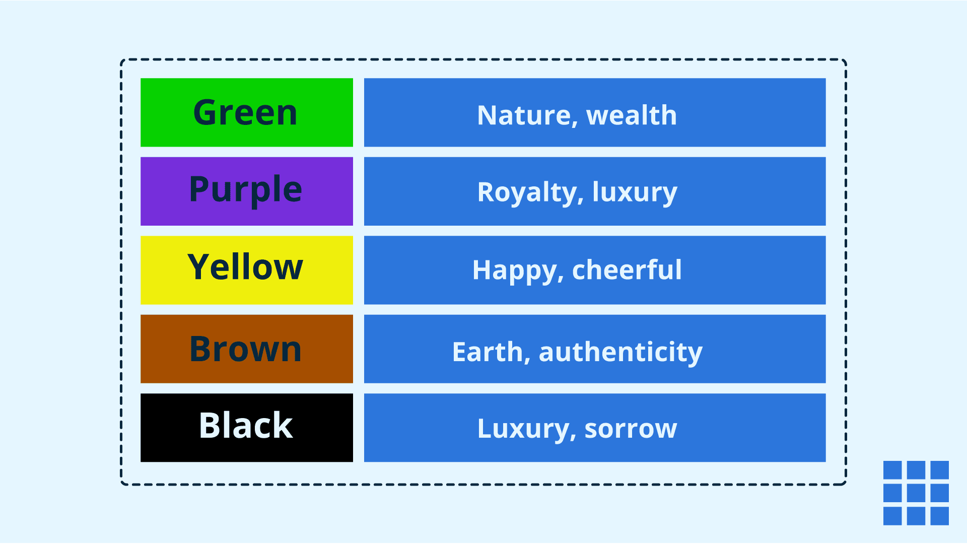
Here’s a quick overview of how commonly used colors are interpreted in user experience (UX) design:
| Color | Meaning in UX | Common associations | Use cases |
| Red | Action & urgency | Passion, excitement, urgency | Call-to-action buttons, error messages, critical notifications |
| Blue | Trust & security | Calmness, reliability, safety | Financial platforms, healthcare apps, tech websites |
| Green | Growth & success | Nature, tranquility, progress | Success messages, progress bars, eco-friendly brand elements |
| Yellow | Attention & energy | Happiness, warmth, energy | Highlights, important alerts, onboarding tips (used sparingly to avoid overstimulation) |
| Purple | Luxury & creativity | Royalty, elegance, imagination | Beauty, fashion, creative industries, art-related or boutique design platforms |
| Black | Power & sophistication | Elegance, modernity, authority | Luxury goods, high-end fashion, minimalist designs |
| Brown | Stability & warmth | Earthiness, simplicity, tradition | Organic brands, handmade crafts, rustic/vintage-themed interfaces |
Choosing the right color in UX design directly impacts usability, emotion and brand perception.
Now that we’ve explored what different colors mean in UX, let’s look at how to put them together in a cohesive and effective color scheme
How to choose the right UX colors for your interface?
A color scheme is a carefully selected combination of colors used together to design a website or app. A well-planned color scheme can significantly enhance usability, create visual harmony and reinforce your brand identity.
From contrast and hierarchy to mood and memorability, the colors you use in your interface can help users feel grounded, engaged and in control.
Whether you’re building a financial dashboard or a wellness app, the best UI color schemes balance aesthetics with accessibility and function.
What are the key principles for choosing a strong color scheme?
When selecting a color scheme for your website or app, keep these core principles in mind to ensure both visual appeal and functional clarity:
- Contrast: Ensure text and backgrounds are easy to distinguish (e.g., white text on navy background).
- Consistency: Stick to a small, branded color palette throughout.
- Visual hierarchy: Highlight primary actions using vibrant accent colors.
- Branding alignment: Ensure colors match your brand’s voice and purpose.
- Light vs dark mode UX:
- Light mode: Ideal for bright environments.
- Dark mode: Reduces eye strain in low light and gives a sleek, modern feel.
Tip: Ensure color accessibility in both modes using contrast ratio tools (like WebAIM’s contrast checker).
Color schemes by industry
Different industries evoke different user expectations. The best UI color schemes support brand perception while enhancing trust and interaction.
| Industry | Traits | Example palette |
| Finance | Trust, security | Navy #002855, Sky Blue #4C9ED9, Soft Gray #F5F7FA |
| eCommerce | Excitement, urgency | Cherry Red #E53935, White #FFFFFF, Deep Gray #2C2C2C |
| Health & Wellness | Calm, balance | Mint Green #A8E6CF, Soft Blue #D0E8F2, Stone Gray #666666 |
What are the tips for creating harmonious color palettes?
Even the most creative color ideas need structure. Here’s how to build a brand palette that supports both function and feel:
- Use a base + accent formula
- Choose 1–2 base colors for primary use (e.g., backgrounds, text).
- Add 1–2 accent colors for buttons, links or highlights.
- Stick to 3–5 core colors
- Too many colors confuse users and dilute branding
- Test contrast early
- Use tools like WebAIM or Stark to check accessibility contrast ratios
- Use color psychology thoughtfully
- Blue = trust, Red = urgency, Green = wellness, Yellow = energy
- Use neutrals to balance bold hues
- Use neutral tones (like grays and soft whites) to balance bold hues and avoid overwhelming users.
- Document your palette
- Create a color guide with hex codes and use cases (e.g., #007BFF = primary CTA)
Pro tip: Try palette generators like Coolors.co, Adobe Color and Khroma.
What is accessibility in UX colors?
Accessibility in color design is about ensuring everyone can easily read, navigate and understand your design.
According to the CDC, about 12 million Americans aged 40 and over have vision impairment.
Good color choices should work for all, including those with low vision or color blindness. Here’s how to make sure your colors are inclusive and user-friendly.
Accessible color design best practices
1. Color contrast ratios (WCAG 2.1)
Use strong contrast between text and background so it’s easy to read. Aim for a ratio of 4.5:1 for normal text.
2. Designing for color blindness
Avoid using color alone to convey meaning. Combine color with text labels, icons or textures.
3. Using texture and icons as backups
Textures and symbols support users who can’t distinguish colors. For example, use a checkmark icon with green.
Tools for testing accessibility
- Lighthouse (Chrome DevTools)
- WebAIM Contrast Checker
- Stark Plugin (Figma/Sketch)
Accessibility in color design is not optional. It’s key to creating inclusive digital products.
What is the emotional impact of UX colors on user decisions?
Colors triggers emotions- and in UX emotions drive actions. According to Don Norman’s emotional design theory, emotional responses drive deeper engagement.
- Trusting colors (like blue) build loyalty.
- Energetic colors (like red or orange) drive action.
- Calm colors (like green) increase satisfaction and trust.
Call-to-action buttons: What colors perform best?
Your CTA buttons are decision-making hotspots—and color plays a big role in their performance. While the “best” color varies by audience and context, certain shades tend to drive stronger engagement:
| Color | Emotion | CTA use case |
| Red (#E53935) | Urgency | “Buy Now,” “Checkout” |
| Green (#43A047) | Success | “Sign Up,” “Confirm” |
| Orange (#FF9800) | Energy | “Start Free Trial” |
| Blue (#1976D2) | Trust | “Log In,” “Subscribe” |
Contrast and placement matter as much as the color itself. The CTA must stand out from the surrounding elements to succeed.

In the above picture, you can see how the yellow color CTA is standing out on a blue colored page. This creates a clear contrast making it easier for users to understand and eventually click through.
What are the top 5 UX color mistakes to avoid?
Picking the perfect color is just half the battle. However, avoiding these common mistakes is what really keeps your CTAs (and your users) moving in the right direction.
- Low contrast: Poor readability causes frustration and bounce.
- Too many colors: Overwhelms and confuses users. Stick to 3–5 core hues.
- Ignoring accessibility: Alienates users with disabilities.
- Color inconsistency: Damages brand recognition.
- Cultural insensitivity: Colors have different meanings in different cultures, so research your target audience.
Emotionally aligned design
Emotionally intelligent UX isn’t just about standout buttons, it’s about choosing other elements like color that reflect your product’s purpose and emotional goals.
For example, Spotify leans into energetic green for action and flow, keeping the experience lively and fluid.

The color palette works not just for branding, but it dictates the user momentum throughout the app. Whether it’s the play button or progress indicators, this vibrant green keeps the experience feeling lively, modern and in motion—mirroring the dynamic nature of music itself.
How does Bluehost help you design with UX colors in mind?
At Bluehost, we make it easy to build websites that look great and work well for every user. Here’s how:
- Customizable templates with built-in color palettes
- Choose from professionally designed templates
- Edit backgrounds, text and buttons easily
- Preview changes in light and dark modes
- WordPress themes with optimized color schemes
- SEO-friendly and accessible designs
- Industry-specific themes with color harmony in mind
- Mobile-first layouts that adapt across devices
- Works seamlessly with page builders like Elementor & Divi
- Live color previews while editing
- Global color settings for brand consistency
- Jetpack tools for accessibility & performance
- Built-in checks for color contrast issues
- Faster load times and better visuals with image optimization
Also read: Best Minimalist WordPress Themes for SEO & Speed (2025)
With Bluehost, you’re not just picking colors, you’re creating better experiences. Design smart, accessible and beautiful websites with ease.
Also read: Boost Your WordPress Analytics with Jetpack Stats | Bluehost
Final thoughts
The best UX happens when design elements are intentional and that starts with color. Use color psychology, accessibility tips and brand-aligned colors to design beautiful, intuitive and result-driven digital experiences.
When you’re building a business, every minute counts.
At Bluehost, our extensive website design solution lets you skip guesswork.
While you focus on what matters most, running your business, our experts craft a visually stunning and user-friendly website tailored to your brand and audience.
Leave the design to us and we’ll make sure your website not only looks great but also works beautifully.
FAQs
Blue (trust), green (success), red (urgency) and yellow (attention) are widely effective depending on your brand and goals.
Colors trigger emotional responses that guide users toward desired actions like clicking buttons, making purchases or staying longer.
Prioritize contrast, avoid using color alone to convey meaning and test designs with accessibility tools.
Red, green and orange are highly effective for CTAs, triggering urgency, success and energy.
UX colors are colors chosen intentionally to guide users, build emotions, improve usability and strengthen brand identity.


Write A Comment